
Case study
BayTree: a brand grown from its name
A name, a voice and an identity for a team of executive assistants who take the weight off busy founders.
- Client
- BayTree
- Year
- 2026
- The work
- Brand Identity
- Brand Strategy
- Print Design
- Brand Strategy

About BayTree
BayTree is a team of dedicated executive assistants for founders and leaders who want to achieve more. They take on the complexity of running a business — coordinating the detail, building systems that make sense and taking the pressure off — so their clients can get on with leading.
The Roots of the Identity
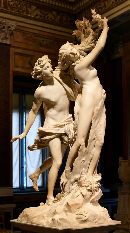
The name BayTree started as something personal — inspired by the founder’s home, Bay Tree Cottage. But it carries far more weight than that.
The Bay Laurel (Laurus nobilis) has meant the same things for thousands of years: victory, intellectual achievement, protection, endurance. It’s evergreen — present through every season, not just the easy ones. It’s aromatic under pressure — its value shows most when things get difficult. And it only bears fruit through closeness. Every one of those qualities maps directly to how BayTree operates.
The mythology runs deeper still. The laurel’s origin traces to Daphne — a figure from Ovid’s Metamorphoses who was transformed under pressure and then honoured for what she became. Not for seeking glory, but for surviving change. That story of female strength, transformation, and quiet endurance sits at the heart of the brand. The laurel crown that followed — awarded at the Pythian Games for intellect and craft, held over Roman generals by someone else enabling their triumph — gave us the words laureate, baccalaureate, and the concept of proven excellence. The name sits inside a lineage that means “this person delivered.”
Visually, the identity draws on two traditions. Sacred geometry — where overlapping forms create organic leaf shapes that only exist through proximity. And Bauhaus-influenced reduction — form follows function, nothing decorative for its own sake. One provides warmth. The other provides structure. Together, they sit exactly where the brand lives: Strategic Enablers who are also Warmly Human.
The name isn’t decoration. It’s the entire brand argument, compressed into two words.
Brand Archetypes
BayTree’s identity is built on a clear archetypal framework — a set of personality patterns that shape how BayTree sounds, feels, and shows up across everything it does.
Think of archetypes as anchors. They keep the brand consistent without making it rigid. Two core archetypes drive the personality; two supporting archetypes add dimension and range.
- Core archetypes
The Caregiver
Nurturing, supportive, and protective of clients’ time and energy.
- Core driver
- Providing a solid foundation of trust and partnership, serving as a human solution in a world of algorithms.
- Brand tone
- Warmly human, friendly, supportive, inclusive, and conversational.
- Keywords
- Supportive, honest, inclusive, protective, human connection.
- Ideal for
- Building genuine connections and high-trust relationships with clients.
-
The Sage
Expert, knowledgeable, and a trusted advisor.
- Core driver
- Seeking new perspectives and breaking out of limitations.
- Brand tone
- Brave, curious, open-minded.
- Keywords
- Innovation, progress, autonomy, challenge, growth.
- Ideal for
- Organisations branching into new sectors or challenging established, perhaps dated, ways of working.
- Supporting archetypes
The Hero
Dedicated to saving the day for overwhelmed founders.
The Hero steps in to rescue admin-heavy operations by providing streamlined, specific support and bespoke structures. When a client is drowning in operational complexity, the Hero archetype is what drives BayTree to roll up its sleeves and get it sorted.
-
The Magician
Focused on making the impossible look easy.
The Magician delivers high-level solutions that large language models simply cannot replicate. It’s the archetype behind BayTree’s ability to take a tangled mess of moving parts and turn it into something that just works — without the client ever seeing the complexity underneath.
Mission Statement
Mission statement
You focus on leading; we’ll handle the rest.
BayTree is the strategic enabler for people who want to achieve more. As dedicated executive assistants, we step up to conquer the complexities of your business, coordinate the details, and use systems that make sense. We release the pressure, giving you the freedom, balance, and confidence to scale your vision.
Reason to believe
More than just keeping your day-to-day running smoothly, we partner with you for the long-term — committed to your business to make sure you’re ready for whatever comes next.
Grounded in the professional capability of our executive assistants, we combine quiet confidence with a genuine care for the human element behind the work. We are the organisers and doers who change the too difficults into deliverables — figuring out the right approach for you and building the smooth, everyday habits that give you, and your business, the solid foundation it needs to thrive.
Colours with a job to do
Evergreen and Laurel do most of the work. Ember, Daphne and Apollo are accents — for highlights and the moments that need attention, never for big blocks of colour. Daphne and Apollo take their names from the myth behind the laurel. Linen, a warm grey, is the only colour ever used as a tint.
Tap a chip to copy its hex code.
- Primary
Evergreen
Pantone 553 C
- CMYK
- 82 30 65 76
- RGB
- 40 71 52
- HEX
- #284734
-
Laurel
Pantone 555 C
- CMYK
- 80 17 76 51
- RGB
- 40 114 79
- HEX
- #28724F
- Secondary
Ember
Pantone 7599 C
- CMYK
- 0 85 98 20
- RGB
- 179 61 38
- HEX
- #B33D26
- Accents
Daphne
Pantone 1767 C
- CMYK
- 0 33 10 0
- RGB
- 252 175 192
- HEX
- #FCAFC0
-
Apollo
Pantone 605 C
- CMYK
- 0 2 100 9
- RGB
- 225 205 0
- HEX
- #E1CD00
- Tonal
Linen
Pantone Warm Grey 2 C
- CMYK
- 6 7 10 11
- RGB
- 203 196 188
- HEX
- #CBC4BC
-
Linen 80%
Pantone Warm Grey 2 C (80%)
- CMYK
- 5 6 8 9
- RGB
- 213 208 201
- HEX
- #D5D0C9
Patterns
A supporting pattern of overlapping circles — the same geometry that produces the vesica piscis at the heart of the mark — extends that thinking beyond the logotype. Used at low contrast it becomes a subtle texture; used boldly it becomes a graphic statement.
-
Primary
This pattern uses the supporting brand colours over the Evergreen background. This is the primary pattern variation. The colours should not be adjusted or swapped to maintain consistency across touchpoints.
-
Texture
This pattern is in solid Warm Grey 2 with a 50% background.
-
Tonal
This pattern is in solid Laurel over a solid Evergreen.