Case study
Big Drop: ten years, and bolder for it
A bolder, cleaner identity and packaging for the alcohol-free brewer’s tenth birthday — ten years after I designed the first one, with nothing from the decade in between left behind.
- Client
- Big Drop Brewing Co.
- Year
- 2026
- The work
- Brand Identity
- Brand Strategy
- Packaging Design
- Website Design & Development
- Brand Strategy
About Big Drop Brewing Co.
Big Drop Brewing Co. has brewed alcohol-free craft beer since 2016: never more than 0.5% ABV, and never short on flavour. The range runs from a Citrus IPA with 3 calories per 100ml to a Milk Stout, in cans and bottles, with a shelf of awards along the way. The aim hasn’t changed in ten years — beer so good, you won’t miss the alcohol.
Ten years, one drop
I designed Big Drop’s original identity in 2016. Back then, alcohol-free beer was something you drank because you had to, not because you wanted to — and most of it looked the part. Big Drop set out to prove that alcohol-free beer could go toe-to-toe with the real thing. The brand had to look like it meant it.
In 2019 I refreshed it. Then, for the tenth anniversary, I went back in again.
The brief was short: bolder and cleaner, without leaving behind any of what got Big Drop here. That drop has been doing the work for ten years. Throwing it away just to look new would have been vanity, not strategy.
Bolder, cleaner — and nothing from the last ten years left on the shelf.
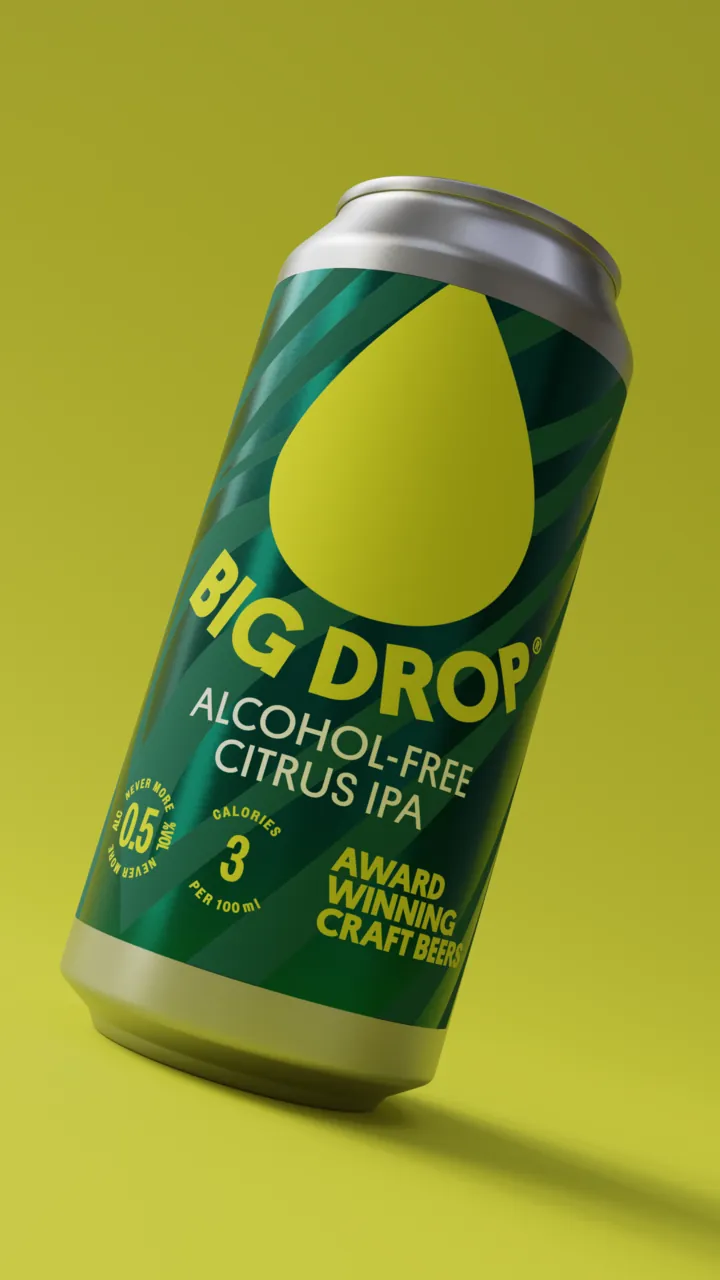
The biggest change is in the logotype. Big Drop Brewing Co. became just Big Drop — two words do the job. And the name now sits on a subtle curve that follows the bottom of the drop. A straight line would have been tidier, but the curve does two jobs: it gives the drop a sense of weight, as if it’s pressing down on the name, and it gives the whole logotype movement and energy.
Cleaner meant taking things away everywhere else, too. The drop is one big, flat shape in one colour, filling most of the label. Everything else on the front has to earn its place: the beer’s name, Edgar, the calories and one claim about awards.
Beer should be more fun
Craft beer isn’t just about the hop profile, the IBU or how long the head brewer’s beard is (nice to know, if that’s your bag). Alcohol-free beer in particular has a habit of taking itself far too seriously.
Big Drop goes the other way. Its six values — bold, honest, playful, vibrant, determined and open-minded — are about energy, not earnestness. Bold, but never Shouty-McShoutface about it. The identity has to carry that before anyone’s opened a can.
Where others might say something is too much, we say it’s not enough.
That line from the playbook is the test for everything: the colour, the photography, the packs.
Brand archetypes
I drew these out after the fact, from the playbook and the work itself: the purpose, the manifesto, the values, the tribes and the lines on the packs. Big Drop’s personality maps neatly onto four archetypes. The Jester and the Explorer lead; the Rebel and the Everyman add range, and keep the fun from drifting into smugness.
- Core archetypes
The Jester
Here for a good time, and to make alcohol-free beer fun again.
- Core motivation
- To bring joy, wit and a bit of mischief to a category that takes itself far too seriously.
- Tone of voice
- Cheeky, warm and irreverent. Never mean, never Shouty-McShoutface.
- In the work
- Edgar, an ABV roundel named after Poe’s raven
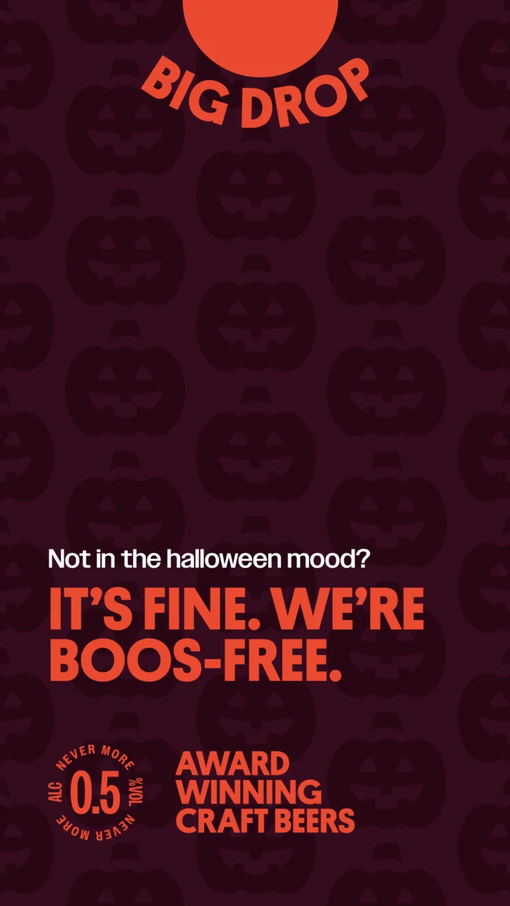
- Lines like “More big is more better” and “It’s fine. We’re boos-free.”
- A palette where too much is never quite enough
-
The Explorer
Says yes to it all, and wants you to as well.
- Core motivation
- To live life to the full and do more of what you love, with nothing to hold you back the morning after.
- Tone of voice
- Upbeat, energetic and up for anything.
- In the work
- The purpose — “Live your biggest life”
- Beer for whatever comes next, from a 6am yoga class to dancing until the lights come up
- Tribes defined by what they do, from Creative Hustlers to Adventurers
- Supporting archetypes
The Rebel
Won’t accept that alcohol-free means missing out.
- Core motivation
- To prove the category wrong, and have fun doing it.
- Role in the brand
- Squares up to the real thing — alcohol-free beer that goes toe-to-toe with it
- Feeds the curiosity that “clips the status quo around the head” and breaks the odd rule
- Gives the packs the nerve to be the loudest thing in the fridge
-
The Everyman
One of the crowd, at the pub, the barbecue or the desk.
- Core motivation
- To belong, and to make sure everyone else does too.
- Role in the brand
- Keeps it open to everyone — “everyday achievers”, with more women drinking it than traditional beer brands see
- Grounds the big talk in real moments, from desk beers to a pint after the morning run
- Keeps it honest — “If we’ve done it, we own it”
One big purpose
Mission statement
Beer so good, you won’t miss the alcohol™
Live your biggest life. Do as much as you can. Jump in with both feet, laugh yourself hoarse and never stop doing more of what you love. For us, that’s brewing the finest, tastiest craft beer we possibly can. And because tomorrow is always another day, it’s alcohol-free.
Reason to believe
We’re big on the things you expect from a craft brewery, so you can enjoy great beer in all its glory: flavour so good you won’t miss the alcohol, ultra-low calories, a range of styles and award-winning taste (we’re the most awarded brewer ever in the UK!).
No shortcuts. No compromise. Just bold, delicious beer that lets you say yes to whatever comes next — be that a 6am yoga class, a big pitch, or dancing until the lights come up.
The range
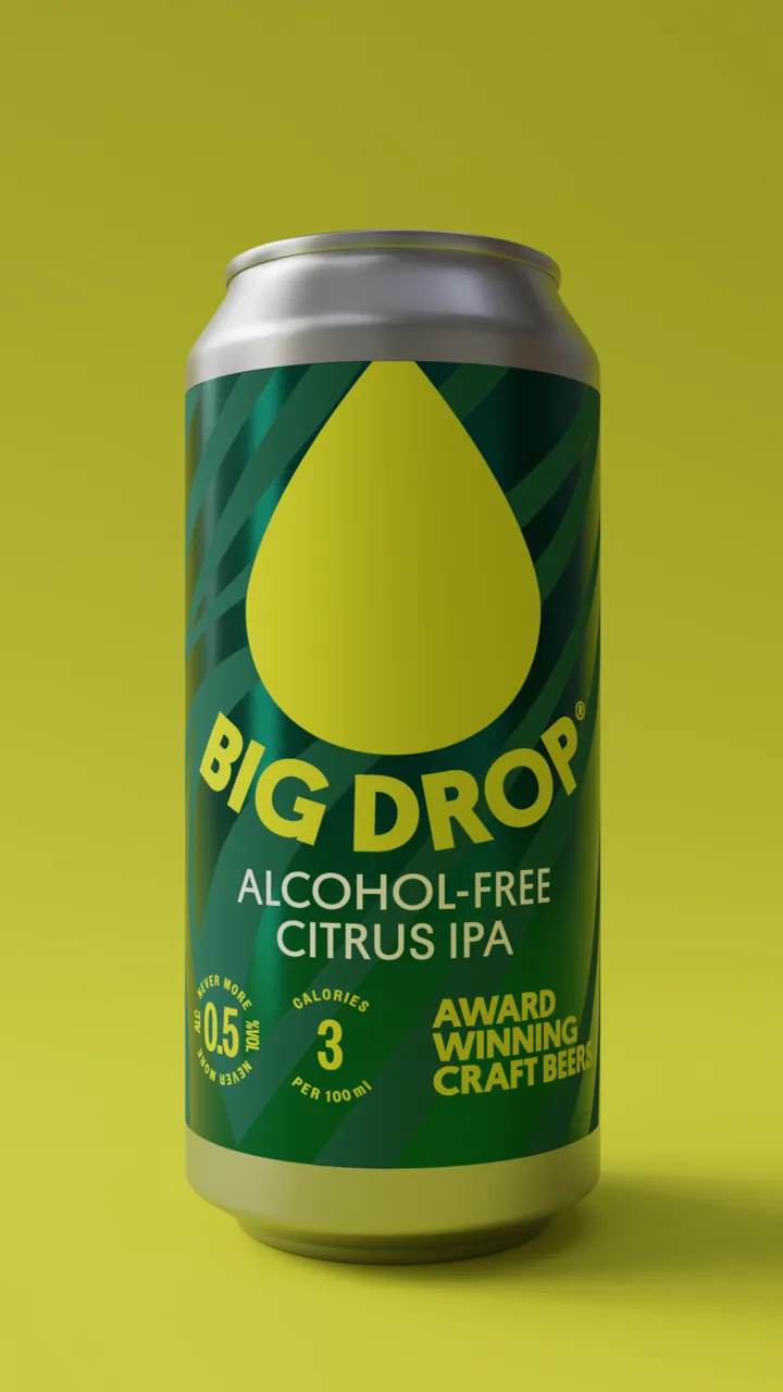
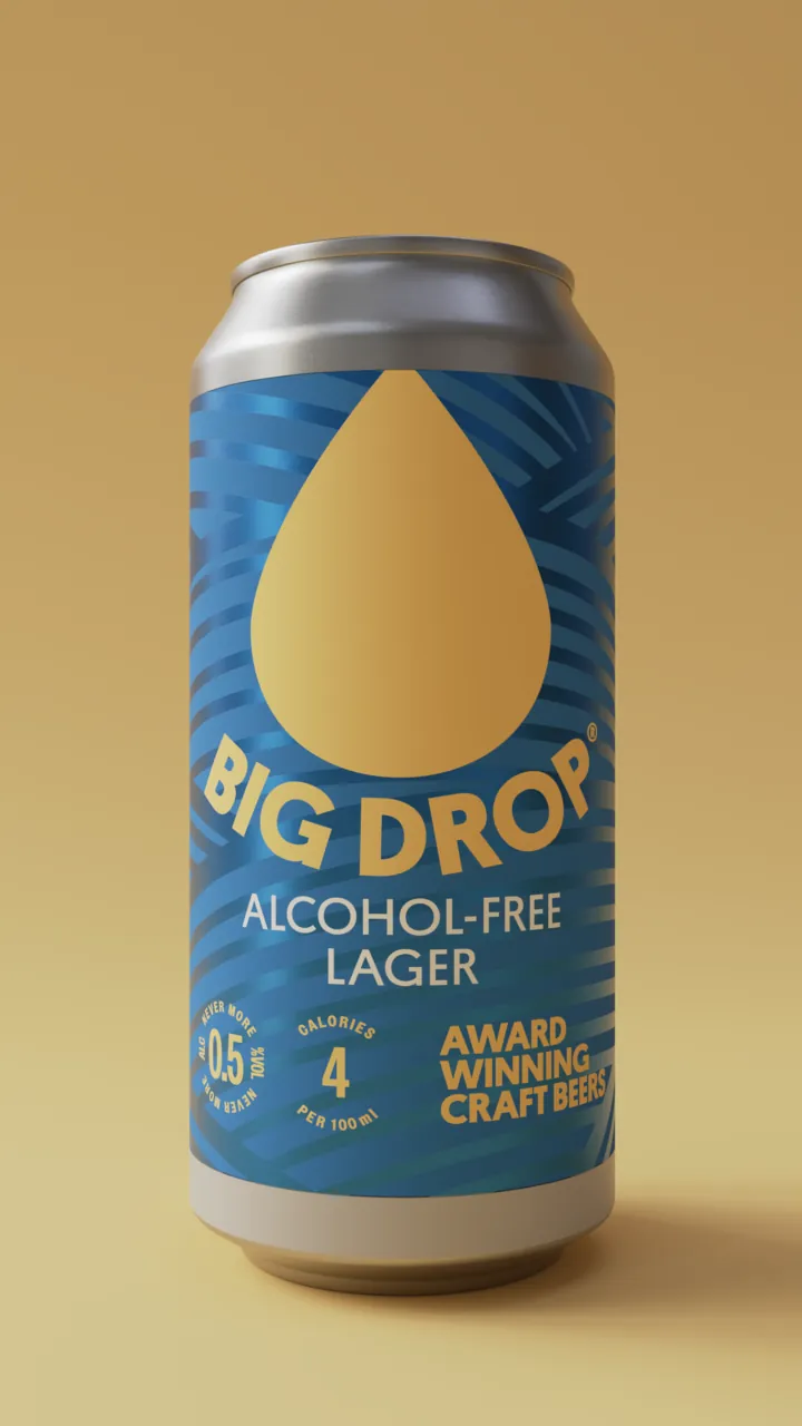
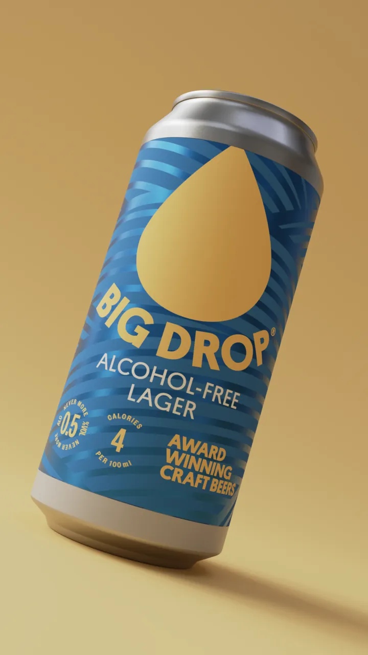
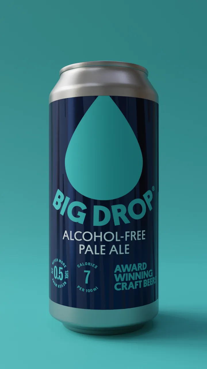
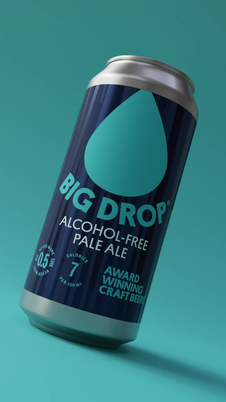
Every beer gets its own colourway, and they’re all one family. Each pack takes its beer’s base colour and pattern, with the drop and wordmark in its accent. Line them up and they read as a set; pick one up and it couldn’t be anything else.
The numbers sit on the front, where you’d look for them: never more than 0.5% ABV, and the calories per 100ml beside it — 3 in the Citrus IPA, 4 in the Lager.
Hover over a pack, or tap it, to see it from another angle.
- 440ml cans
Citrus IPA -
Lager -
Pale Ale -
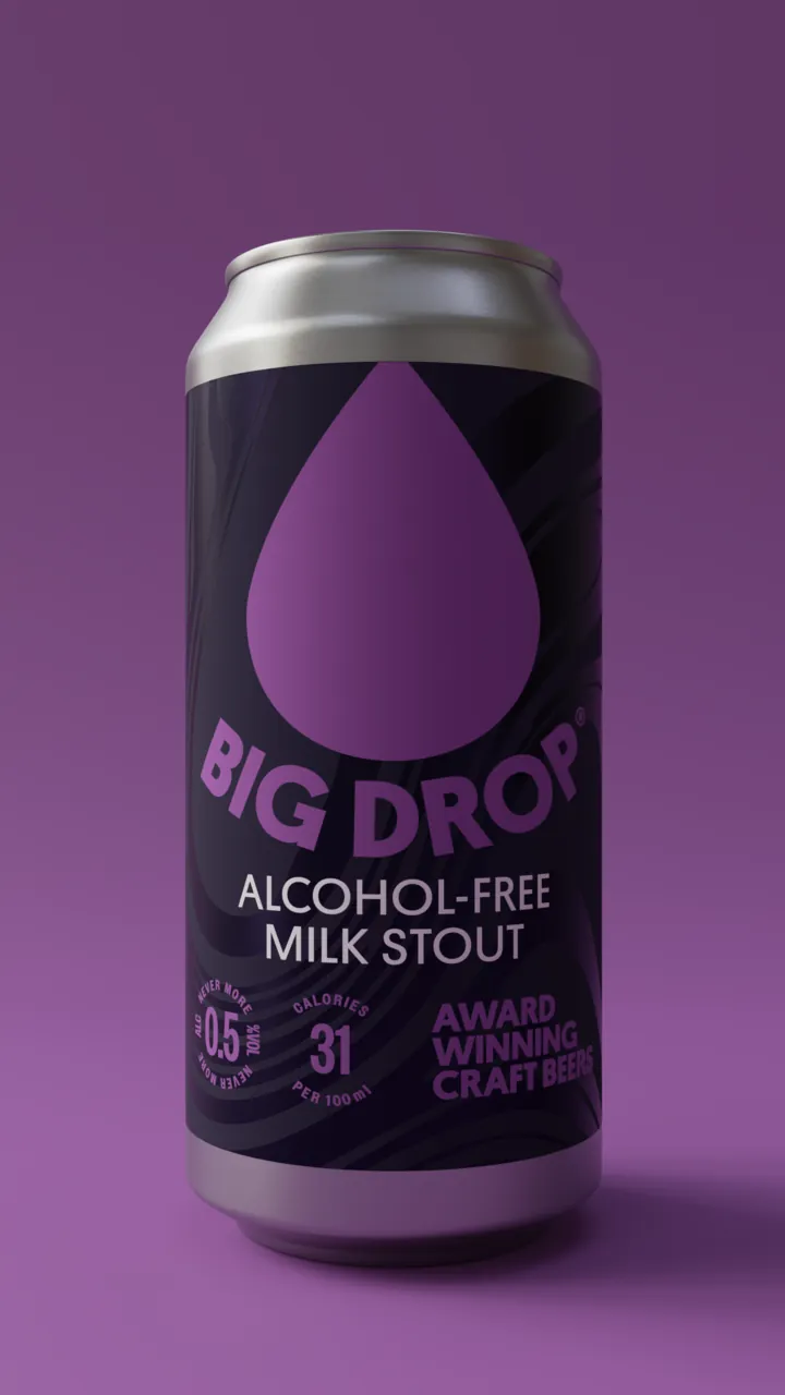
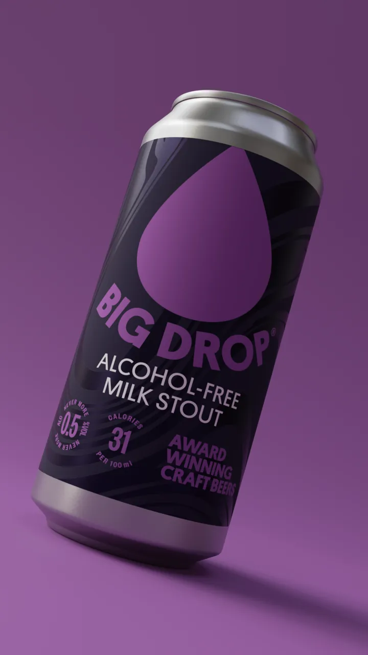
Milk Stout - Bottles
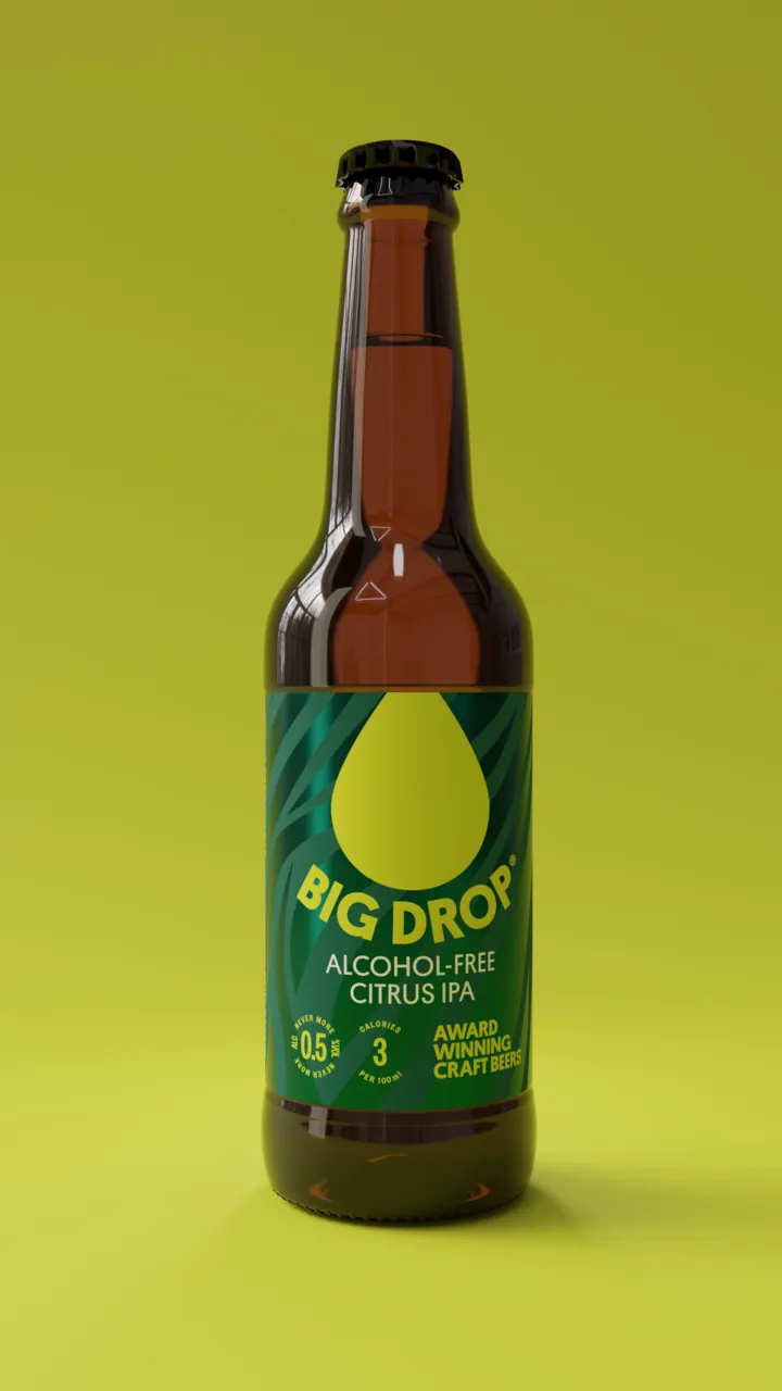
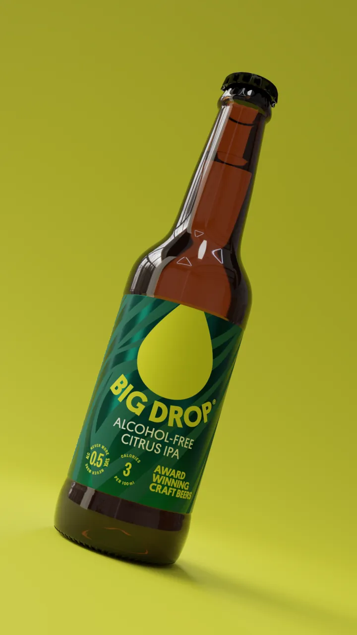
Citrus IPA -
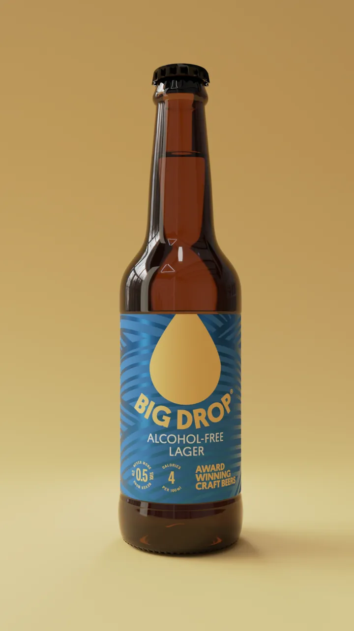
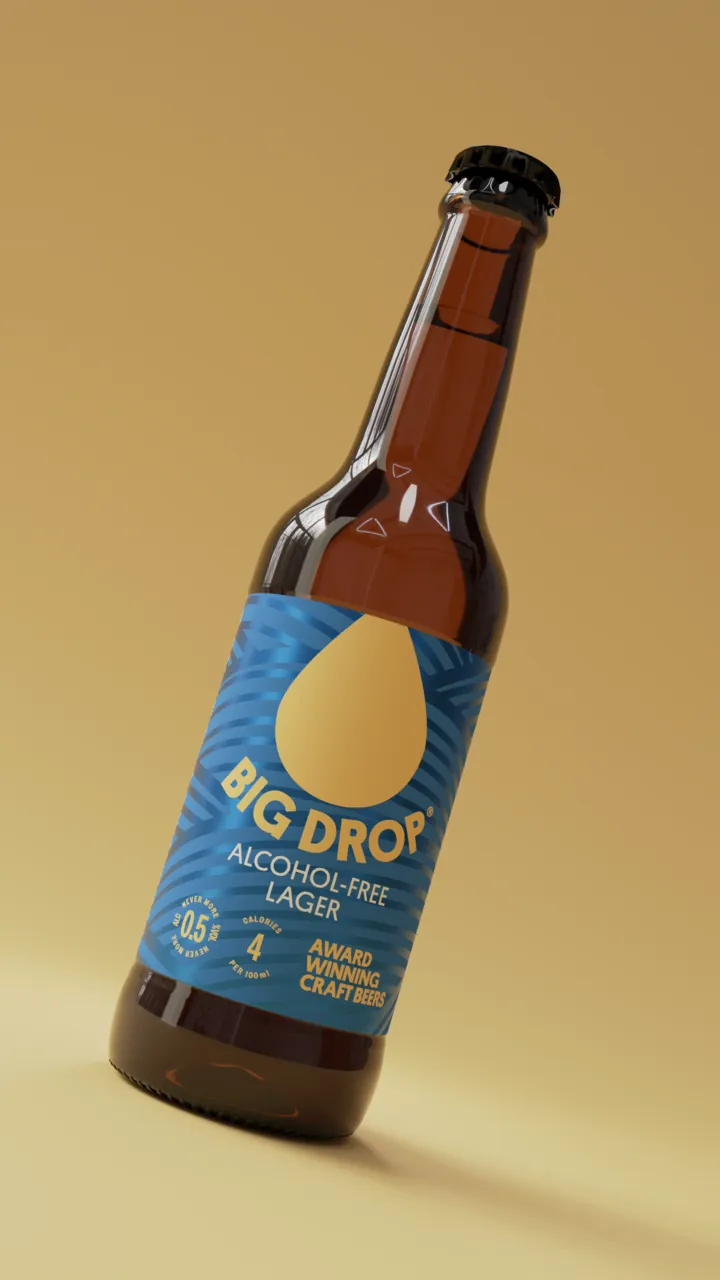
Lager -
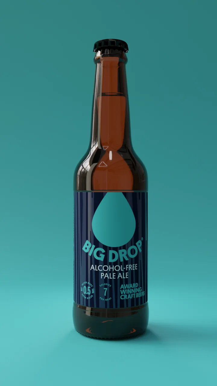
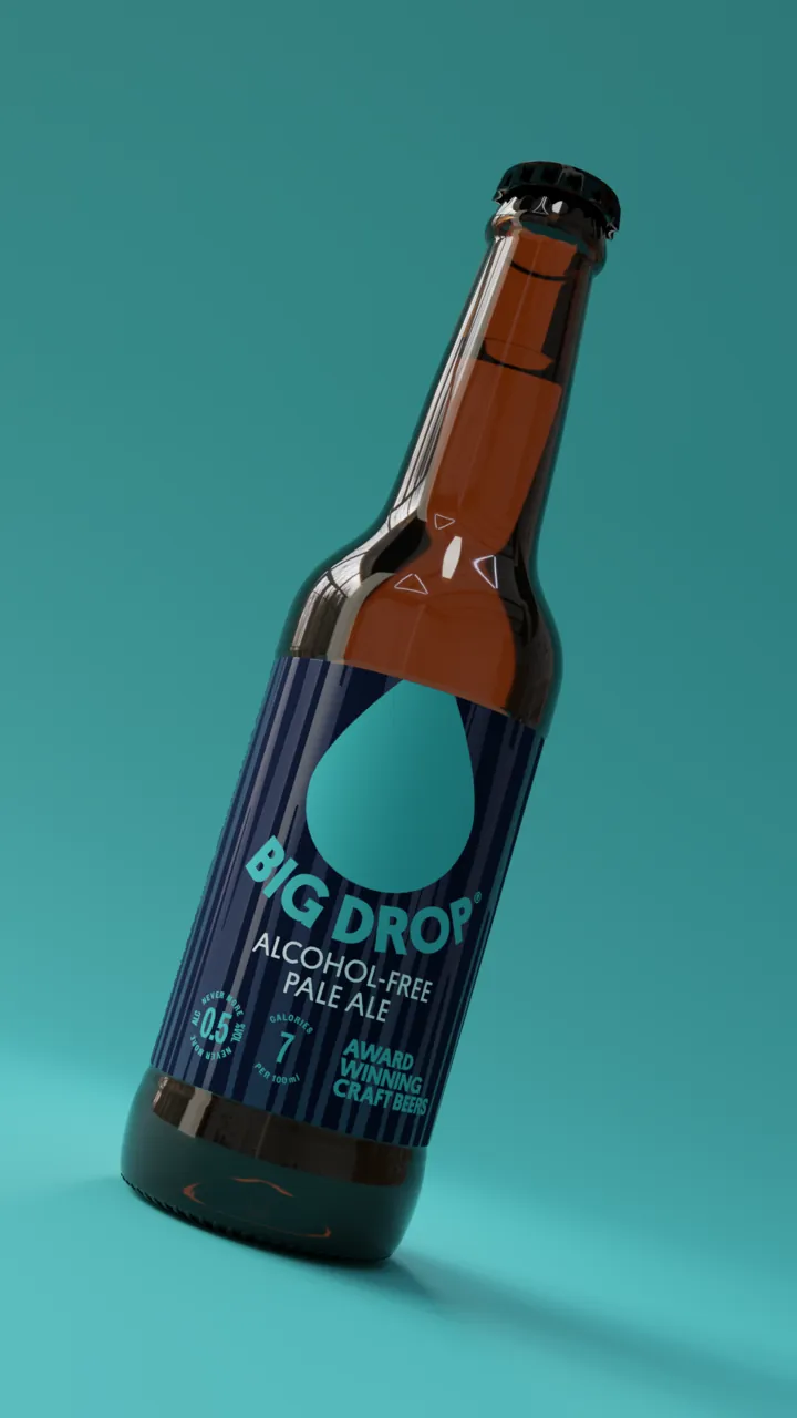
Pale Ale -
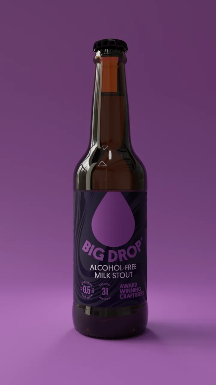
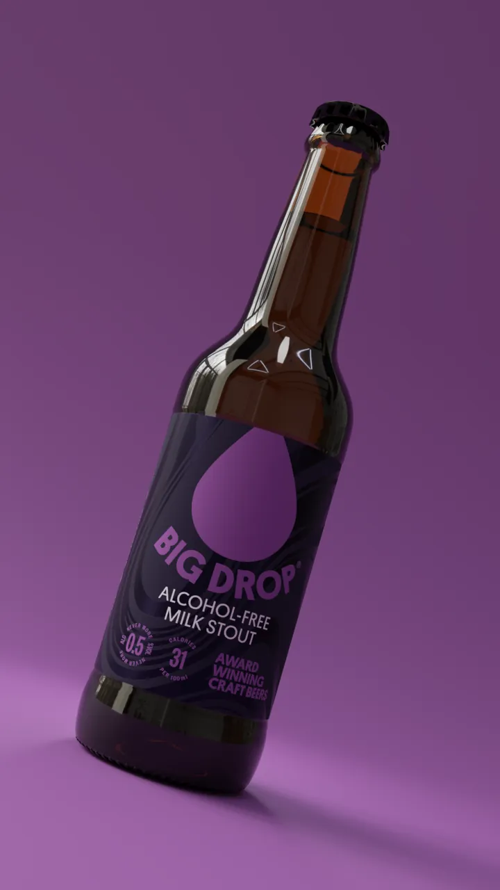
Milk Stout
Colour, turned up
Every beer has its own pair: a base colour that does three-quarters of the work and an accent that does the rest. Around them sits a brand palette of ten colours for anything that isn’t about one beer in particular — and when it is, a brand colour can sit beside the beer’s own to push the energy up.
They’re bright on purpose. Alcohol-free doesn’t have to mean muted.
Tap a chip to copy its hex code.
- Brand
Deep Pink
Pantone 213 C
- CMYK
- 0 99 49 0
- RGB
- 255 3 130
- HEX
- #FF0382
-
Crimson
Pantone 185 C
- CMYK
- 0 100 77 0
- RGB
- 255 0 59
- HEX
- #FF003B
-
Orange Red
Pantone 172 C
- CMYK
- 0 72 86 0
- RGB
- 255 71 36
- HEX
- #FF4724
-
Indigo
Pantone 2736 C
- RGB
- 71 18 120
- HEX
- #471278
-
Light Sea Green
Pantone 3258 C
- CMYK
- 71 0 8 24
- RGB
- 56 194 178
- HEX
- #38C2B2
-
Slate Blue
Pantone 266 C
- CMYK
- 61 67 0 17
- RGB
- 82 69 212
- HEX
- #5245D4
-
Medium Sea Green
Pantone 360 C
- CMYK
- 54 0 60 30
- RGB
- 82 178 71
- HEX
- #52B247
-
Green Yellow
Pantone 388 C
- CMYK
- 5 0 83 8
- RGB
- 224 235 41
- HEX
- #E0EB29
-
Gold
Pantone 109 C
- CMYK
- 0 17 100 0
- RGB
- 255 212 0
- HEX
- #FFD400
-
Dark Magenta
Pantone 2602 C
- CMYK
- 13 100 0 44
- RGB
- 125 0 143
- HEX
- #7D008F
- IPA
IPA
Pantone 561 C
- CMYK
- 100 0 12 65
- RGB
- 0 89 78
- HEX
- #00594E
-
IPA Accent
Pantone 388 C
- CMYK
- 1 0 78 13
- RGB
- 219 221 49
- HEX
- #DBDD31
- Pale Ale
Pale Ale
Pantone 655 C
- RGB
- 23 52 102
- HEX
- #173466
-
Pale Ale Accent
Pantone 3252 C
- CMYK
- 63 2 0 26
- RGB
- 70 186 189
- HEX
- #46BABD
- Milk Stout
Milk Stout
Pantone 276 C
- CMYK
- 35 46 0 80
- RGB
- 34 28 52
- HEX
- #221C34
-
Milk Stout Accent
Pantone 2582 C
- RGB
- 147 86 158
- HEX
- #93569E
- Lager
Lager
Pantone 2727 C
- CMYK
- 81 44 0 12
- RGB
- 42 125 225
- HEX
- #2A7DE1
-
Lager Accent
Pantone 1345 C
- CMYK
- 0 18 47 1
- RGB
- 253 207 133
- HEX
- #FDCF85
- DDH IPA
DDH IPA
Pantone 3272 C
- CMYK
- 82 0 11 33
- RGB
- 30 171 152
- HEX
- #1EAB98
-
DDH IPA Accent
Pantone 7548 C
- RGB
- 255 198 0
- HEX
- #FFC600
A pattern for every beer
Each beer also has a pattern of its own — leaves for the Citrus IPA, rolling arcs for the Lager, stripes for the Pale Ale, swirls for the Milk Stout and woodgrain for the Brown Ale. They’re set tone-on-tone in the base colour, so they add texture and character without ever competing with the drop.

Citrus IPA

Lager

Pale Ale

Milk Stout

Brown Ale
Half a drop
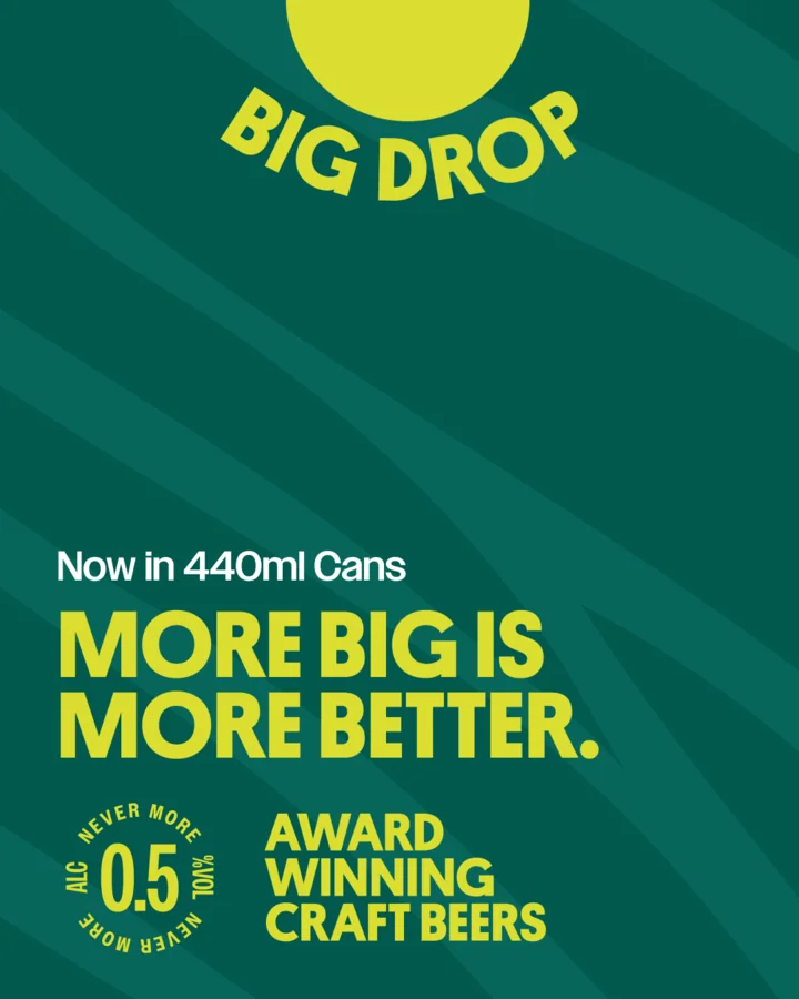
Big Drop lives on phones as much as on shelves, and a whole drop takes up a lot of room at the top of a post. So there’s a half-drop setup: the drop cut off by the top edge, with the name curving underneath it just as it does on the packs. It saves a lot of height and still reads as Big Drop at a glance. A version of it sits in the header of bigdropbrew.com, too.
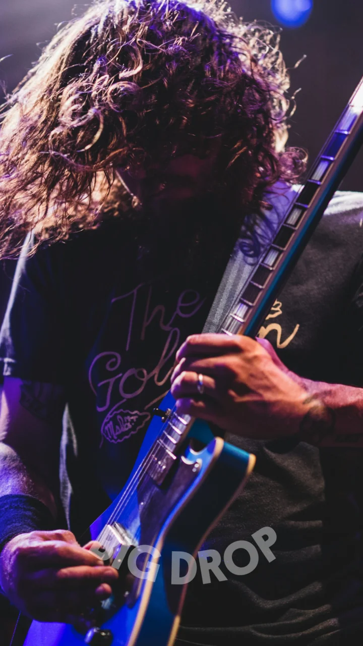
The posts follow two recipes. Brand-led ones put a headline in the brand colours, with or without a photo. Beer-led ones wear a beer’s own colourway and pattern. Over video, the name goes on its own as a watermark.
- Grid posts
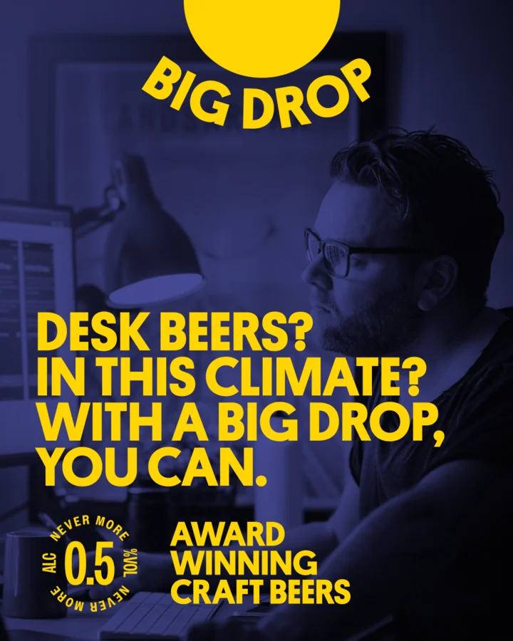
Brand-led -
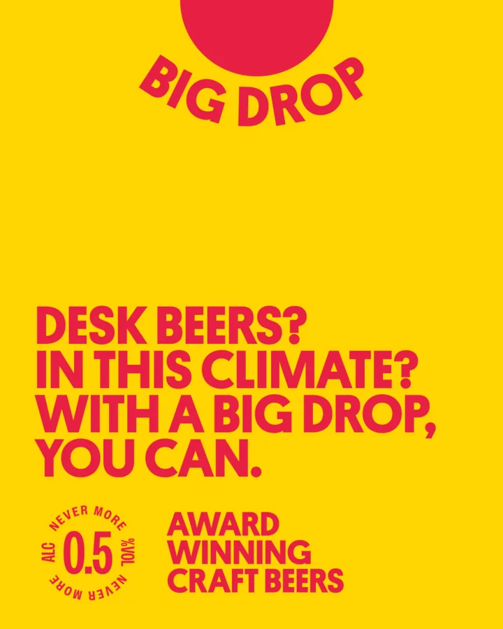
Brand-led, type only -
Citrus IPA - Stories
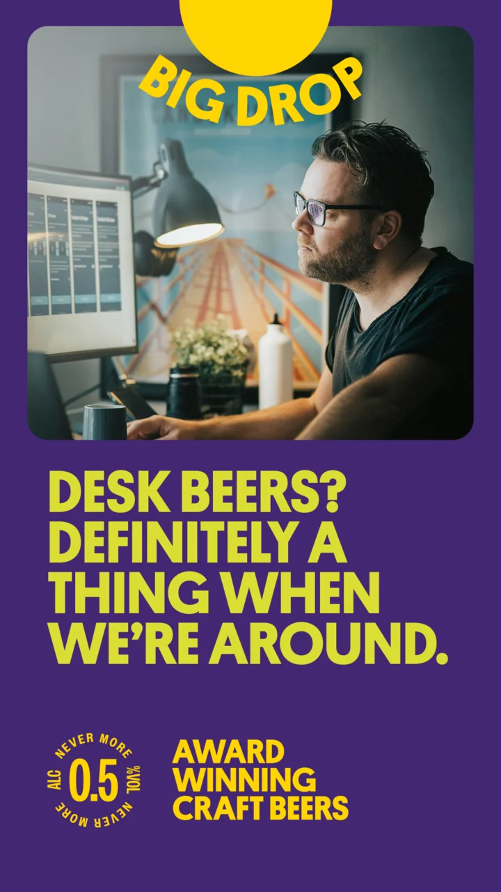
Brand-led -
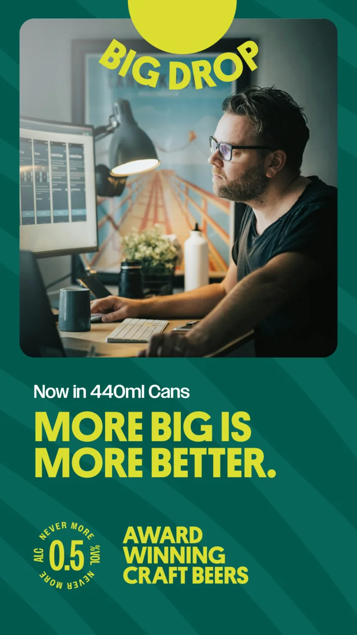
Citrus IPA -
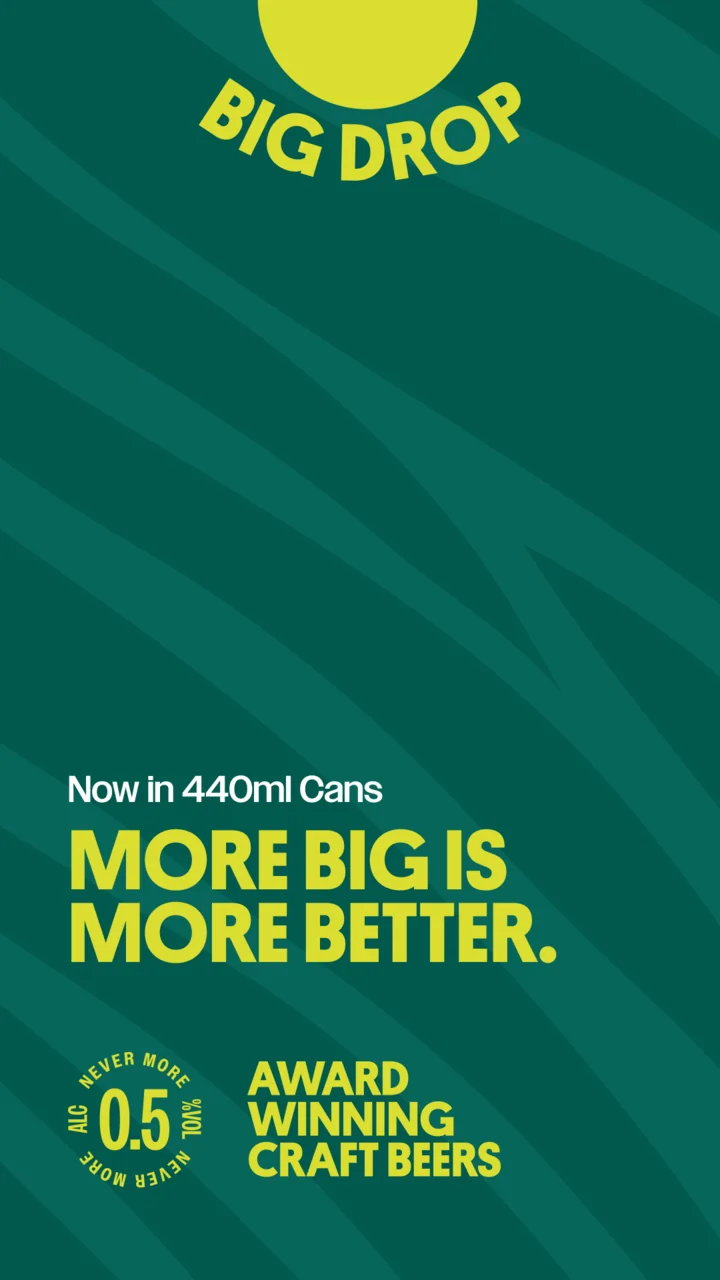
Citrus IPA, pattern -
Seasonal -
Video watermark
Nevermore
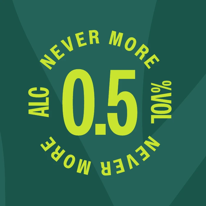
Every pack carries Edgar, a roundel promising the beer inside will never be more than 0.5% ABV. There are versions for the UK and Europe, the USA and Australia, and none is ever printed smaller than 12mm across.
Why Edgar? Quoth the Raven: “Nevermore.”
(It’s the kind of joke you only get on the second look. That’s rather the point — the brand rewards a little attention, and doesn’t take itself too seriously while it does.)