Case study
Brandee: named for the people behind the bar
A name, a logotype and a strapline for the brand training app that rewards hospitality staff for learning about the drinks they serve.
- Client
- Brandee
- Year
- 2024
- The work
- Brand Identity & Naming
- Brand Strategy
About Brandee
Brandee is the first brand training app for hospitality. Front-of-house teams (bartenders, servers, retail staff) learn about the products they sell through short quizzes, and every quiz earns points they can swap for real rewards. It’s free for venues; drinks and food brands sponsor the quizzes, and get better-trained teams and data from the shop floor in return.
From Brandy to Brandee
Brandee started life as Brandy. I can see the appeal: it’s short, it’s friendly and it has brand right there in it. But in a business built around drinks, brandy is already something on the back bar. And it names a thing, when the app is really about people.
Swapping the y for ee changes what the word does. English already has a family of -ee words, and every one of them is a person on the receiving end of something:
- Employee — a person employed for wages or a salary
- Trainee — a person training for a job or a profession
- Payee — a person who is paid, or is to be paid
- Nominee — a person put forward for a position
Brandee joins the family.
Brandee: a person rewarded for giving brands key trade insights.
Same sound, same friendliness, but now the name describes the person using it. (It also stops the app sounding like a digestif.) Both the name and the strapline went through basic trademark searches before anyone got too attached to them.
Three audiences, one name
Brandee has to work for three different people at once:
- Front-of-house staff, who need a reliable, engaging way to learn about the brands they serve, and to be rewarded for it
- Hospitality operators, who need training for their teams they can track, and a way to work with drinks brands
- Drinks brands, who need up-to-date training in front of the people who sell their products, and insight into how those products are doing on the shop floor
That’s a lot of jobs for one identity. And every venue and brand it works with already has a loud identity of its own.
A logo that knows its place
Brandee sits alongside national restaurant chains, global beer brands and independent breweries. It shouldn’t try to out-shout any of them; it should look good standing next to all of them. So the brief for the logo was a balancing act. It had to:
- Be simple and appealing on its own, and still fit all three audiences
- Sit beside other brands without looking overbearing, contradictory or awkward
- Work in a single solid colour, with other colourways to line up with partners
- Be bold and confident, but not overwhelming
- Hint at data, growth and performance without being blatant about it
- Be straightforward, with a little playfulness and character
- Be something you’d happily wear on a T-shirt, and just as happy to put in a pitch deck
brand, then ee
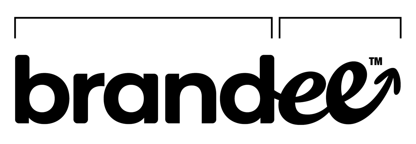
The answer splits the word in two. brand is set in a clean, straightforward sans serif, almost a placeholder, so the brands Brandee works with can bring their own character and tone without anything clashing.
Then the ee breaks into script: a personal, handwritten flourish that ends in an arrow, heading up and to the right like a line on a growth chart. The whole idea of the name — the person, not the product — sits in those two letters. So does the data.
It travels, too. The ee and its arrow can hook onto the end of a partner’s name and turn it into a call to action, aimed squarely at the people who make the decisions.
Rewarding Insights
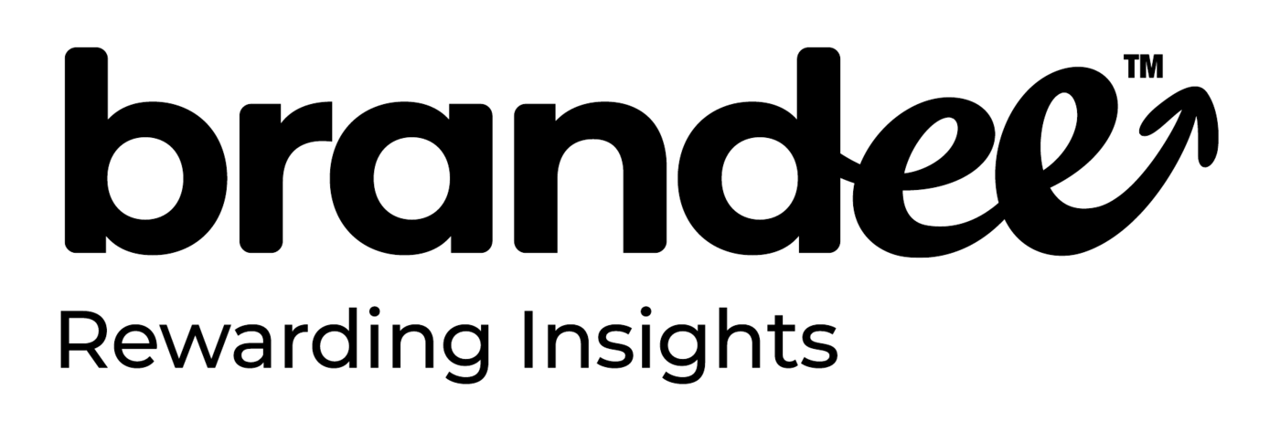
The strapline works twice over. Brands find the insights rewarding, because they’re getting good on-trade data from the people who actually pour their drinks. Front-of-house staff, meanwhile, are literally being rewarded.
Two greens
The palette is two greens: an ultra-vivid one and a muted forest one. How much of each you use depends on who you’re talking to, front-of-house staff or the brands paying for the quizzes. Solid black or white copy adds contrast where it’s needed.
Tap a chip to copy its hex code.
- Greens
Vivid Green
- CMYK
- 63 0 80 0
- RGB
- 0 251 115
- HEX
- #00FB73
-
Forest Green
- CMYK
- 87 23 97 8
- RGB
- 3 130 64
- HEX
- #038240
- Contrast
Black
- RGB
- 0 0 0
- HEX
- #000000
-
White
- RGB
- 255 255 255
- HEX
- #FFFFFF
Out in the world
A logotype that works in a pitch deck has to survive a staff T-shirt, too. On merch, the name runs diagonally across the shirt, too big to fit, with the arrow pointing up and out. On a phone screen, the ee and its arrow are enough on their own.
- Merch
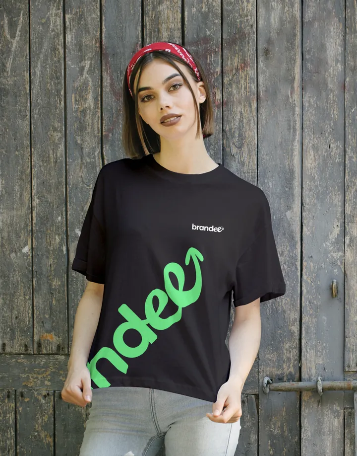
Black tee -
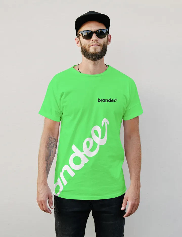
Green tee - App and social

App icon -

Social avatar