
Case study
Cor: heart, choir and a three-week deadline
A name, an identity and a website for the arts company that turns social value commitments into measurable impact. Three weeks, start to finish.
- Client
- Cor
- Year
- 2025
- The work
- Brand Name & Identity
- Website Design & Development
About Cor
Cor runs epic arts projects for social value. It works with organisations that have social value obligations — in construction, infrastructure, technology and energy — to build Cor Community Hubs: programmes of creative participation, staff engagement and progression pathways, designed from the outset to leave behind evidence of change. Behind it is a team of artists, producers and social value specialists.
Heart and choir
Cor started without a name. Two founders, one from theatre and one from management consulting, had a business that sits somewhere unusual: arts projects, delivered for organisations with social value commitments to meet, and measured properly at the end.
It needed a name that could hold both halves. I landed on Cor.
In Latin, cor means heart. In Irish, it means choir. One word, three letters, and the two ideas the business runs on.
Heart for care, purpose and authenticity. Choir for connection, collaboration and collective voice.
Then there’s the third meaning, the one you already know. Cor! is what comes out of a British mouth when something stops you in your tracks. Surprise, joy, wonder and excitement, in one syllable.
That’s the reaction the work is after: a landmark lit up with projections a neighbourhood made, a hall full of people drumming in time. If nobody says cor, it probably wasn’t epic enough.
So the name holds all three. What the business cares about, how it works, and the noise people make when it lands.
It’s short enough to say in a corridor and plain enough to sit on a tender document. The full stop came with the logo: Cor. A statement, not a suggestion.
Three weeks
The client had a deadline, and it wasn’t moving. Name, identity, guidelines and a working website: three weeks.
That shapes how you work. There’s no room for a month of mood boards, so the positioning and personality got settled first and everything after was measured against them. The brand had to feel human and credible — energy, warmth and conviction, in front of people who sign off procurement.
One shape

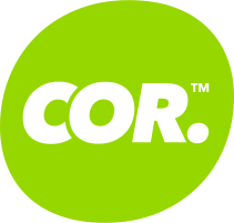
The logo is one shape and one word. The shape is round but not a circle: slightly lopsided, closer to a thumbprint or a pebble. Something a person made, not something a compass did.
Inside it, COR. is set in a heavy italic, leaning forward. It’s loud and warm, and it’s going somewhere.
The strapline does the explaining: Epic Arts Projects for Social Value. Lockups come with it and without, in the primary colours, lime, mono, black and white.
Lime and Racing Green
Three colours, and they lead everything.
Lime Green is the energy: bright enough to feel like an arts company. Racing Green sits underneath it, steady enough for a boardroom. Cream is the page they both sit on.
Anything else is a supporting act, and has to pass WCAG AA against whatever it’s next to.
- Core palette
Lime Green
Pantone 375 C
- CMYK
- 54 0 90 0
- RGB
- 151 215 0
- HEX
- #97D700
-
Racing Green
Pantone 3435 C
- CMYK
- 93 25 85 63
- RGB
- 21 71 52
- HEX
- #154734
-
Cream
Pantone 7401 C (50%)
- CMYK
- 0 0 6 0
- RGB
- 255 253 238
- HEX
- #FFFDEE
Out in the world
The website was part of the same three weeks. I designed and built it, so the identity never had to survive a handover.
It’s Racing Green and Cream throughout, with the lime mark top left and photography washed in green so pictures from very different projects — a school hall, a hospital, a building site — sit together as one brand. The strapline is the first thing you read.
The guidelines landed alongside it: logo, clear space, colour and type, in ten pages. Enough to keep it consistent, short enough that someone will read them.
Who’s behind this?







More case studies
- Big Drop Brewing Co.
Big Drop: ten years, and bolder for it
- Deben Carpets & Flooring

Deben: for the flow of home
- BayTree

BayTree: a brand grown from its name
- Road Planing Supplies

RPS: three bars and a road surface
- Knowing Works
Knowing Works: insight with people at its heart
- Brandee
Brandee: named for the people behind the bar
- Ipswich.love

Ipswich.love: a heart in the middle of Ipswich