Case study
Deben: for the flow of home
A new identity, strapline and website for Suffolk’s family flooring firm, in its fortieth year.
- Client
- Deben Carpets & Flooring
- Year
- 2026
- The work
- Brand Identity
- Brand Strategy
- Website Design
- Signage & Clothing
- Acquisition Strategy
- Brand Strategy

About Deben Carpets & Flooring
Deben Carpets & Flooring is a family-run flooring firm in Suffolk, started in 1986 and run today by Chris and Rachel Bixby. From a showroom at Martlesham Heath, it supplies and fits carpets, luxury vinyl tiles, wood and vinyl floors, stair runners and commercial flooring for homes and businesses across the county.
Forty years on the floor
Deben Carpets & Flooring has been fitting floors across Suffolk since 1986, and it’s still a family firm. Forty years and three generations in, it needed an identity, a strapline and a website that matched the work.
The brief came out of long conversations and a survey. The references Deben chose were telling: Finisterre, Vivobarefoot and Rolex. Closer to home, I added regional brands it should feel at home beside, like Adnams, Snape Maltings and Jarrolds. Different worlds, but they all share the same few qualities.
Unfussy, clean, confident, classic and typographic.
Old trade signwriting went into the mix too: hand-painted lettering on shopfronts and vans, a family name worn with pride.
For the flow of home
Everything in a home rests on the floor. The furniture. The light. The footfall. The way you live. A floor isn’t just decoration — it’s the foundation.
Get it right, and everything else flows.
That’s where the line comes from. For the flow of home is about more than what’s underfoot: the way one room leads to the next, the way light moves, the way materials meet. Deben’s job is to lay the foundation for all of it.
Brand archetypes
Three archetypes came out of the brief: the Sage, the Magician and the Ruler. Here they are in Deben’s own voice.
- Brand archetypes
The Sage
Three generations of knowing how floors live.
Three generations of laying floors have taught us how materials live in a home — how they wear, how they sit, how they age. We share what we know, honestly, before any sample book is opened.
-
The Magician
Sees what a home could become.
We see what a home could become. The right material, the right transition, the right craft — and a house starts to move differently. Rooms connect. The space begins to flow.
-
The Ruler
Premium as a way of working, not a price point.
Premium isn’t a price point for us — it’s a way of working. Considered materials, installations finished by hand, and a refusal to cut a corner that someone else will eventually have to fix.
What it’s for
Mission statement
For the flow of home.
A family business since 1986. We work for the homeowners, designers and developers who understand that a home isn’t a set of rooms. It’s a rhythm. The way light moves. The way materials meet. The way one space leads to the next. Our job is to lay the foundation for that rhythm. Quietly considered, built to last.
Reason to believe
Over 40 years as a family-run firm, with three generations of skill and knowledge about every kind of flooring.
A showroom at Martlesham Heath, free in-home measures and estimates, and floors from the makers they trust.
A b with a twist
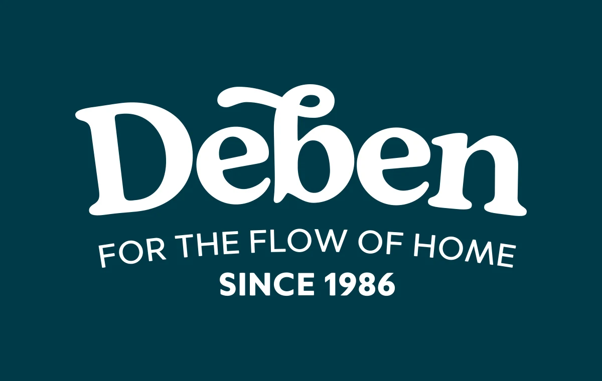
Deben shares its name with the river that runs down through Woodbridge to the sea, and the identity leans into that.
I presented two approaches: a bold, arched DEBEN in the spirit of a signwritten van, and a softer wordmark with more swing to it. The second won. It’s a warm, rounded serif with one flourish: the b rises and curls back over itself like a coil of rope.
Underneath, Carpets & Flooring and Since 1986 arc gently. A second version swaps the descriptor for the strapline, for when the name needs no introduction.
Over 40 years
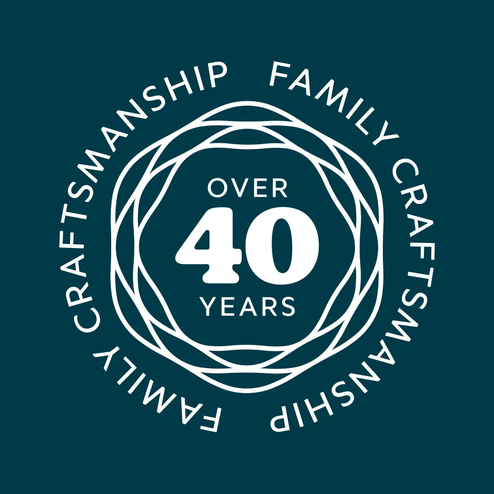
For the fortieth year there’s a quality mark: Family craftsmanship running round a ring of rope, with Over 40 years in the middle.
It sits in the website’s hero, follows you round in the bar at the foot of every page, and can stamp anything else that needs the family name behind it.
The rope
In the early designs the rope ran under the wordmark. In the final identity it’s set free: four strands twisting together, a nod to the boatyards on the river and to the weave of a good carpet.
On the website it never sits still. It runs edge to edge as a divider, loops behind panels and cuts across cards, always a little too big for the space it’s in. Like this.
Colour from the river
The colours are named for the estuary. Boat Yard, a deep river blue, carries everything, with two darker shades beneath it. Low Tide, the colour of wet sand, sets the type.
Samphire, the green of the salt marsh, and Suffolk Pink, after the county’s pink-washed cottages, are the accents. The buttons that ask you to book a free estimate are Suffolk Pink.
Tap a chip to copy its hex code.
- Primary
Boat Yard
- RGB
- 0 58 72
- HEX
- #003A48
-
Low Tide
- RGB
- 240 229 206
- HEX
- #F0E5CE
- Accents
Samphire
- RGB
- 111 116 47
- HEX
- #6F742F
-
Suffolk Pink
- RGB
- 223 122 123
- HEX
- #DF7A7B
- Deeper water
Boat Yard Deep
- RGB
- 0 43 60
- HEX
- #002B3C
-
Boat Yard Night
- RGB
- 0 27 37
- HEX
- #001B25
Out in the world
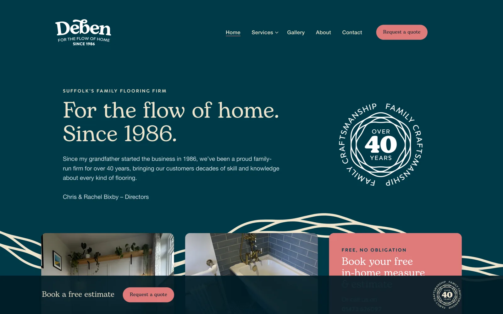
The website does the selling: Boat Yard throughout, Low Tide serif headlines, the rope sweeping through, and a bar to book a free estimate that never leaves the screen.
The identity runs on to the signage and the team’s clothing, so the family name turns up the same way everywhere, from the showroom at Martlesham Heath to the people who come to measure up.