
Case study
Knowing Works: insight with people at its heart
A new name, voice and identity for the independent research organisation grown from Healthwatch Suffolk.
- Client
- Knowing Works
- Year
- 2025
- The work
- Brand Name & Identity
- Brand Strategy
- Website Design & Development
- Brand Strategy
About Knowing Works
Knowing Works is an independent insight and research organisation that grew out of Healthwatch Suffolk. It brings co-produced, person-centred research to health, care, education and beyond — rigorous and reflective, without losing the human connection.
From Healthwatch Suffolk to Knowing Works
Knowing Works emerges from the deep roots of Healthwatch Suffolk — an organisation widely respected for its person-centred ethos, credibility, and commitment to listening. Over the years, Healthwatch Suffolk became known not just as a statutory body, but as a trusted voice for lived experience and meaningful engagement.
As systems grew more complex and the need for co-produced insight expanded, it became clear there was an opportunity — and a responsibility — to evolve. Stakeholders told us they wanted something that could retain the strengths of Healthwatch Suffolk, but with greater independence, broader reach, and sharper focus.
“We’re not academic, but we bring valid insights through community reach and co-production — and we share results in ways people can connect with and use.”
This new venture builds on that foundation, bringing forward the values that made Healthwatch Suffolk successful — inclusivity, accessibility, equity, transparency, and kindness — while creating the space to act with more agility, adaptiveness, and innovation.
It exists to:
- Bridge the gap between statutory insight and community voice
- Expand impact across health, care, education, and beyond
- Deliver rigorous, reflective research without losing the human connection
While no longer operating under the Healthwatch banner, the heart of the work remains the same: to make systems better by involving the people who use them.
“Our motivation is always to include people in shaping projects and services that help them.”
This brand is the next chapter — more independent, more ambitious, but always grounded in the power of people’s experiences.
Brand Archetypes
Knowing Works’ identity is built on a clear archetypal framework that reflects who it is, how it shows up, and the impact it intends to make.
- Lead archetype
The Sage
- Core Motivation
- To seek and share knowledge that empowers others to make informed, meaningful decisions.
- Tone of Voice
- Thoughtful, honest, clear, and educational.
- Key Attributes
- Insight-led and evidence-based
- Trusted and rigorous, without being academic
- Deeply curious and reflective
- Committed to clarity, understanding, and truth
- Supporting archetypes
The Magician
- Core Motivation
- To create transformation through insight and imagination.
- Role in the Brand
- Brings a spark of possibility to our storytelling and co-produced work
- Supports our capacity to turn complexity into clarity and vision into change
- Reinforces the belief that people’s stories can reshape systems
-
The Caregiver
- Core Motivation
- To serve, nurture, and put people first.
- Role in the Brand
- Grounds our work in compassion, accessibility, and community values
- Balances the intellect of the Sage with humanity and warmth
- Reminds stakeholders that we are here to support, not dominate
Brand Colours & Tints
The colour palette has been carefully selected to create a distinct and recognisable identity. Deep Green, the primary brand colour, doesn’t use tints. It should always be used in its solid form.
Tap a chip to copy its hex code.
- Primary
Deep Green
Pantone 5661 C
- CMYK
- 84 20 58 54
- RGB
- 0 86 74
- HEX
- #00564A
- Secondary
Lime
Pantone 382 C
- CMYK
- 28 0 100 0
- RGB
- 196 216 46
- HEX
- #C4D82E
-
Seafoam
Pantone 557 C
- CMYK
- 44 4 37 10
- RGB
- 132 182 160
- HEX
- #84B6A0
-
Orange
Pantone 7579 C
- CMYK
- 0 74 100 0
- RGB
- 242 103 34
- HEX
- #F26722
-
Warm Grey
Pantone Warm Grey 9 C
- CMYK
- 23 32 34 51
- RGB
- 114 99 93
- HEX
- #72635D
-
Purple
Pantone 520 C
- CMYK
- 67 95 9 40
- RGB
- 78 26 93
- HEX
- #4E1A5D
- Tints at 60%
Lime 60%
Pantone 382 C (60%)
- CMYK
- 17 0 59 0
- RGB
- 220 229 148
- HEX
- #DCE594
-
Seafoam 60%
Pantone 557 C (60%)
- CMYK
- 31 5 26 0
- RGB
- 184 208 194
- HEX
- #B8D0C2
-
Orange 60%
Pantone 7579 C (60%)
- CMYK
- 0 44 60 0
- RGB
- 236 164 119
- HEX
- #ECA477
-
Warm Grey 60%
Pantone Warm Grey 9 C (60%)
- CMYK
- 38 38 38 2
- RGB
- 159 149 145
- HEX
- #9F9591
-
Purple 60%
Pantone 520 C (60%)
- CMYK
- 56 67 21 3
- RGB
- 123 100 140
- HEX
- #7B648C
Gradients
So long as primary content remains legible, you can use the solid brand colours and their 60% tints to make up subtle gradients. Gradients should never be used as a colour for text.
This could be useful where you’re wanting to use a call-out on a page, or add some subtle definition to a section of content.
-
Lime
#C4D82E to #DCE594
-
Seafoam
#84B6A0 to #B8D0C2
-
Orange
#F26722 to #ECA477
-
Purple
#4E1A5D to #7B648C
-
Warm Grey
#72635D to #9F9591
Patterns
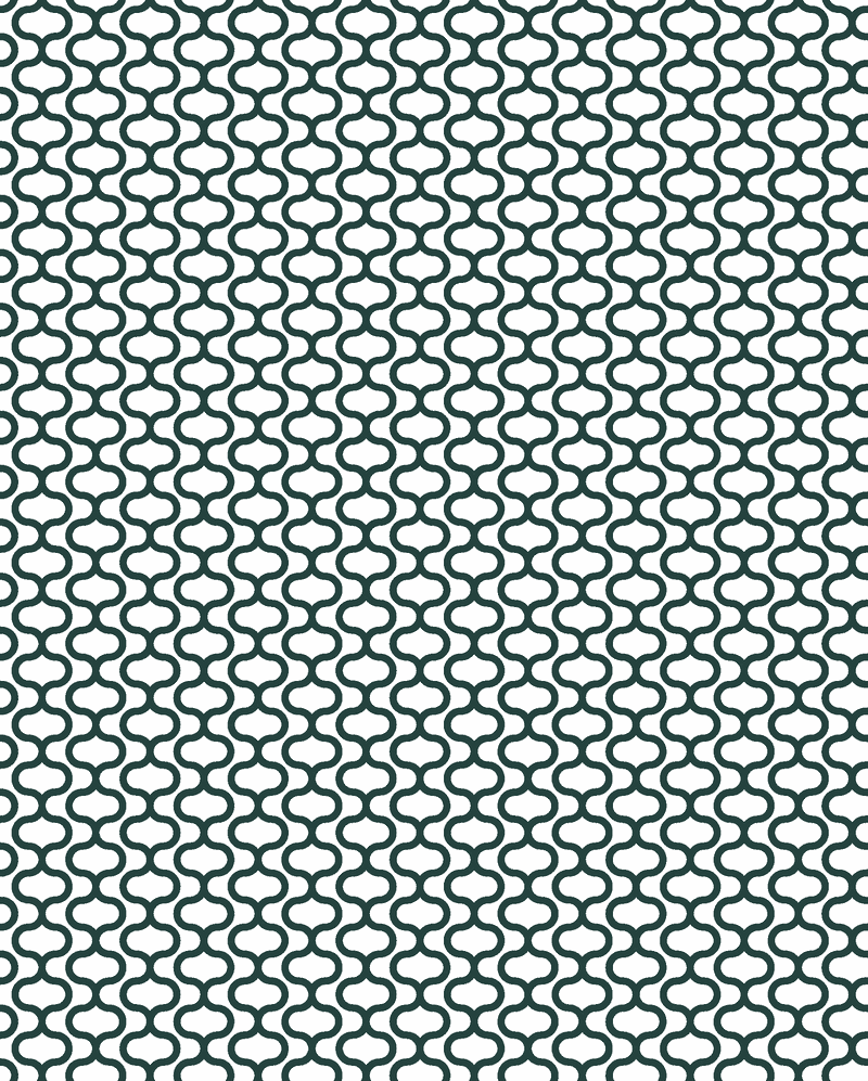
Alongside the core visual identity, a series of supporting patterns have been developed from the origins of the Knowing Works “K” symbol. These patterns draw inspiration from the curly bracket — a familiar mark in data functions — connecting the brand’s visual language back to its roots in knowledge, structure, and meaning.
These patterns are designed to add depth and texture to the brand system. They work best when used to break up solid colour fields, introduce moments of visual interest, and provide a sense of rhythm across materials.
To maintain balance, patterns should be applied with subtlety. They are most effective as tints or tonal layers, rather than bold or heavily contrasting treatments. Used in this way, they enhance rather than overpower, ensuring that the brand’s clarity and confidence remain front and centre.

Pattern one
Pattern two