
Case study
My Health Our Future: a ribbon young people can own
A protectable identity for My Health Our Future, the Knowing Works programme that turns what young people say about their health into change. One ribbon, two parts, and a six-degree tilt.
- Client
- Knowing Works
- Year
- 2026
- The work
- Sub-brand Identity
- Brand Guidelines
About Knowing Works
Knowing Works is an independent insight and research organisation that grew out of Healthwatch Suffolk. It brings co-produced, person-centred research to health, care, education and beyond. My Health Our Future (MHOF) is one of its programmes, and the one with the strongest name of its own.
A name worth protecting
My Health Our Future started life as a project. It turned into a framework other people wanted, and a name with its own reputation, a year after I named and branded Knowing Works itself.
That’s a good problem, but it is a problem. A strong name with no identity behind it is easy to borrow (and easy to copy badly). So the job was to give MHOF something it could own and protect: a mark that’s recognisable, simple enough to trademark, and clearly its own.
It also had a lot of people to speak to at once:
- Young people, who the whole thing is for
- Schools and education trusts, who run it with them
- Health authorities, who act on what comes out
And it couldn’t be tied to one county. The framework travels, so the identity has to travel with it.
Part of the family
MHOF needed to stand up alone and still look like it belongs to Knowing Works.
The Knowing Works symbol is built from a section of a curly bracket, the mark used to group things in data. Those sweeping lines set the direction here too: a band that bends, changes course and keeps going. It sits MHOF in the same family, and it quietly reinforces the parent brand every time it’s used.
The type does the same job. The logo is set in Basic Sans, which Knowing Works already uses everywhere else.
Ownership and continuation
The identity had two things to say. This belongs to young people. And what they put in goes somewhere.
So it’s a ribbon in two parts. My Health is the young people’s part. Our Future is where their input ends up. A fold joins them, and there’s an arrow at each end, so the whole thing reads as progress, not a full stop.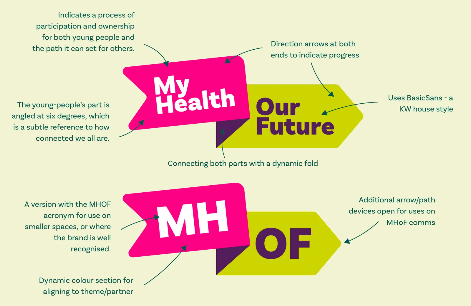
The first part is tilted by six degrees.
That’s a nod to six degrees of separation, the idea Frigyes Karinthy floated in 1929 and Stanley Milgram tested with his “small world experiment” in 1967. Nearly a hundred years on we’re a lot closer together than that. It’s here as a story, not a statistic: a small reminder of how connected we all are.
The whole name, or four letters
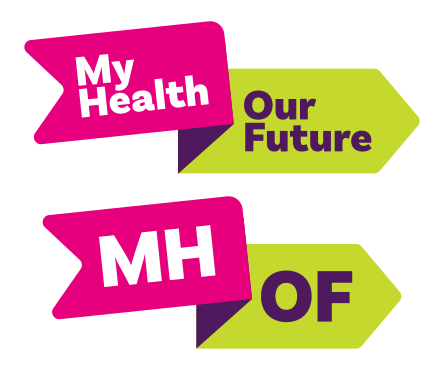
There are two lockups. The full name is the default. The acronym is for small spaces, and for the places where MHOF is already well known and doesn’t need spelling out.
Same ribbon, same tilt, same fold. Only the words change.
Room for partners
MHOF is run with other organisations, and they should feel it’s theirs too.
So the first part of the ribbon can change colour to match a partner or a theme. The second part can’t. It always stays in Knowing Works colours, which means however far the first part travels, you can still tell whose programme it is.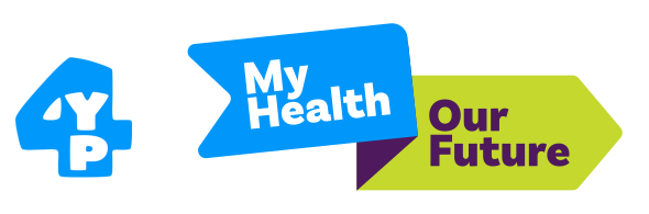
One colour, when it has to behave
Some places don’t want colour. Website footers, official letters, a row of other people’s logos.
Both lockups come in a single colour for exactly that, in black or in white. The ribbon’s shape does the work on its own: the tilt, the fold and the arrows are all still there.
Colours
The young people’s part is solid magenta: 100% magenta in print, one spot ink, nothing mixed. It’s about as loud and as simple as a colour gets.
The future part is lime and purple, taken straight from the Knowing Works palette. Deep Green is the parent brand’s primary, so MHOF sits comfortably on it.
- The ribbon
Magenta
Pantone Process Magenta C
- CMYK
- 0 100 0 0
- RGB
- 230 0 126
- HEX
- #E6007E
- Knowing Works
Lime
Pantone 382 C
- CMYK
- 28 0 100 0
- RGB
- 196 216 46
- HEX
- #C4D82E
-
Purple
Pantone 520 C
- CMYK
- 67 95 9 40
- RGB
- 78 26 93
- HEX
- #4E1A5D
-
Deep Green
Pantone 5661 C
- CMYK
- 84 20 58 54
- RGB
- 0 86 74
- HEX
- #00564A
Beyond the logo
A ribbon is a useful shape to have around. The start of the path keeps its size and its angle, and the outgoing line can stretch to carry a heading, a callout or a short paragraph. It can hold an icon for signposting. It can even stop being straight and curve its way round a page.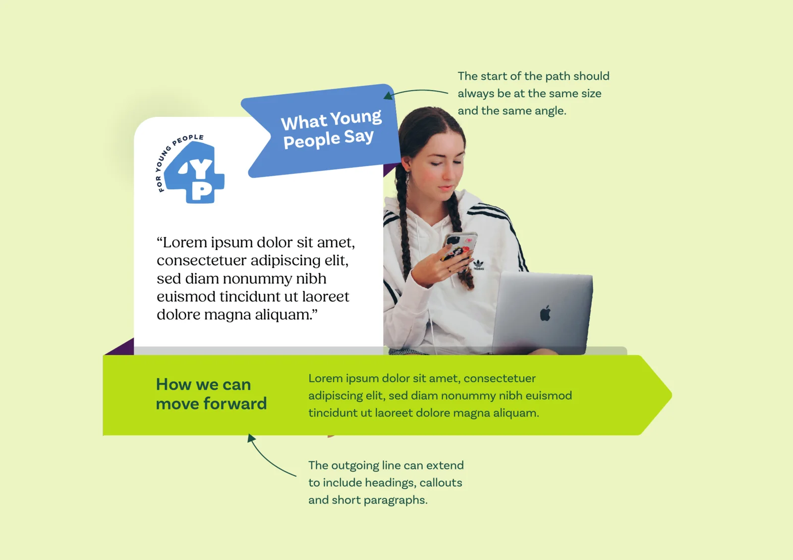
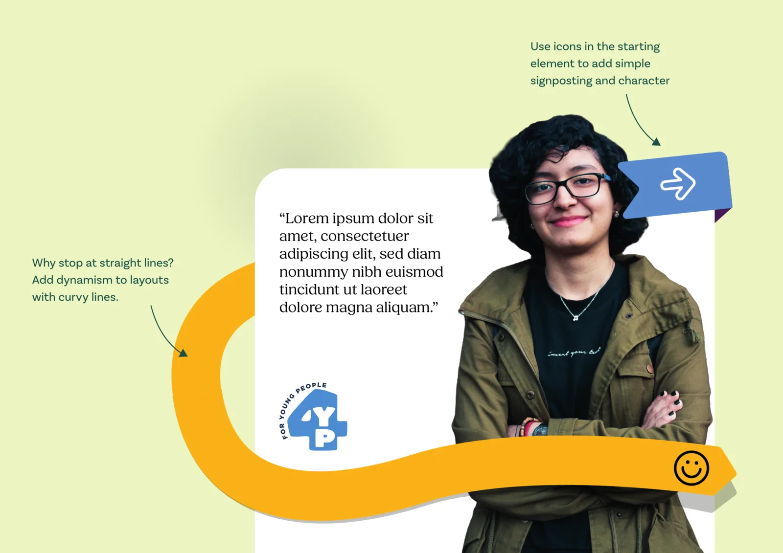
That gives MHOF’s reports and comms a way of laying things out that’s already theirs, without reaching for the logo every time.
It’s all written up in the Knowing Works brand playbook, alongside the parent brand it grew from.
Who’s behind this?







More case studies
- Big Drop Brewing Co.
Big Drop: ten years, and bolder for it
- Deben Carpets & Flooring

Deben: for the flow of home
- BayTree

BayTree: a brand grown from its name
- Road Planing Supplies

RPS: three bars and a road surface
- Cor
Cor: heart, choir and a three-week deadline
- Knowing Works
Knowing Works: insight with people at its heart
- Brandee
Brandee: named for the people behind the bar
- Ipswich.love

Ipswich.love: a heart in the middle of Ipswich