
Case study
RPS: three bars and a road surface
A logo, a two-colour palette and a pair of sub-brands for Road Planing Supplies, all built from one mark: three bars of road, with the top one on the move.
- Client
- Road Planing Supplies
- Year
- 2026
- The work
- Brand Identity
- Sub-brand Identities
- Website Design & Development
- Sub-brand Identities

About Road Planing Supplies
Road Planing Supplies (RPS) collects, recycles and supplies road planings and reclaimed asphalt for highway contractors, local authorities and civil engineering firms. It runs haulage, regulated waste facilities and a graded aggregates supply from sites in Hampshire and Somerset, working everywhere south of the Severn-Wash line.
What comes off the road
When a road is resurfaced, the old surface has to go somewhere. A planer mills it off, and what’s left is a lorry-load of planings: reclaimed asphalt that’s far too useful to throw away.
That’s where Road Planing Supplies comes in. RPS collects planings from highways jobs, recycles them and supplies them back out as material someone else can build with. Haulage, waste management and graded aggregates, across the South and South West of England.
It’s honest, heavy, practical work. The identity needed to be the same.
Three bars
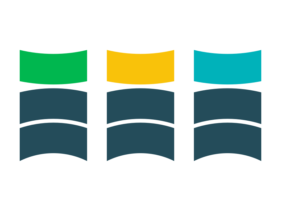
The mark is three bars, each with a slight curve, stacked like layers of road. Two sit together in Foundation Blue. The third sits above them in green, with a gap underneath.
That gap is the idea. Is the top bar being laid? Lifted? Carried off to somewhere it’s needed more?
It’s a road surface being added, removed or transferred. RPS does all three.
It’s a geometric shape, not a drawing of a lorry or a planer. So it stays readable on the side of a wagon, on a hi-vis vest and at the size of a favicon. And it doesn’t date the moment the fleet changes.
Short name, long name
The business is known as RPS on site and Road Planing Supplies on paper, so the logo comes both ways: the initials set big beside the mark, or the full name stacked in three lines to match the three bars.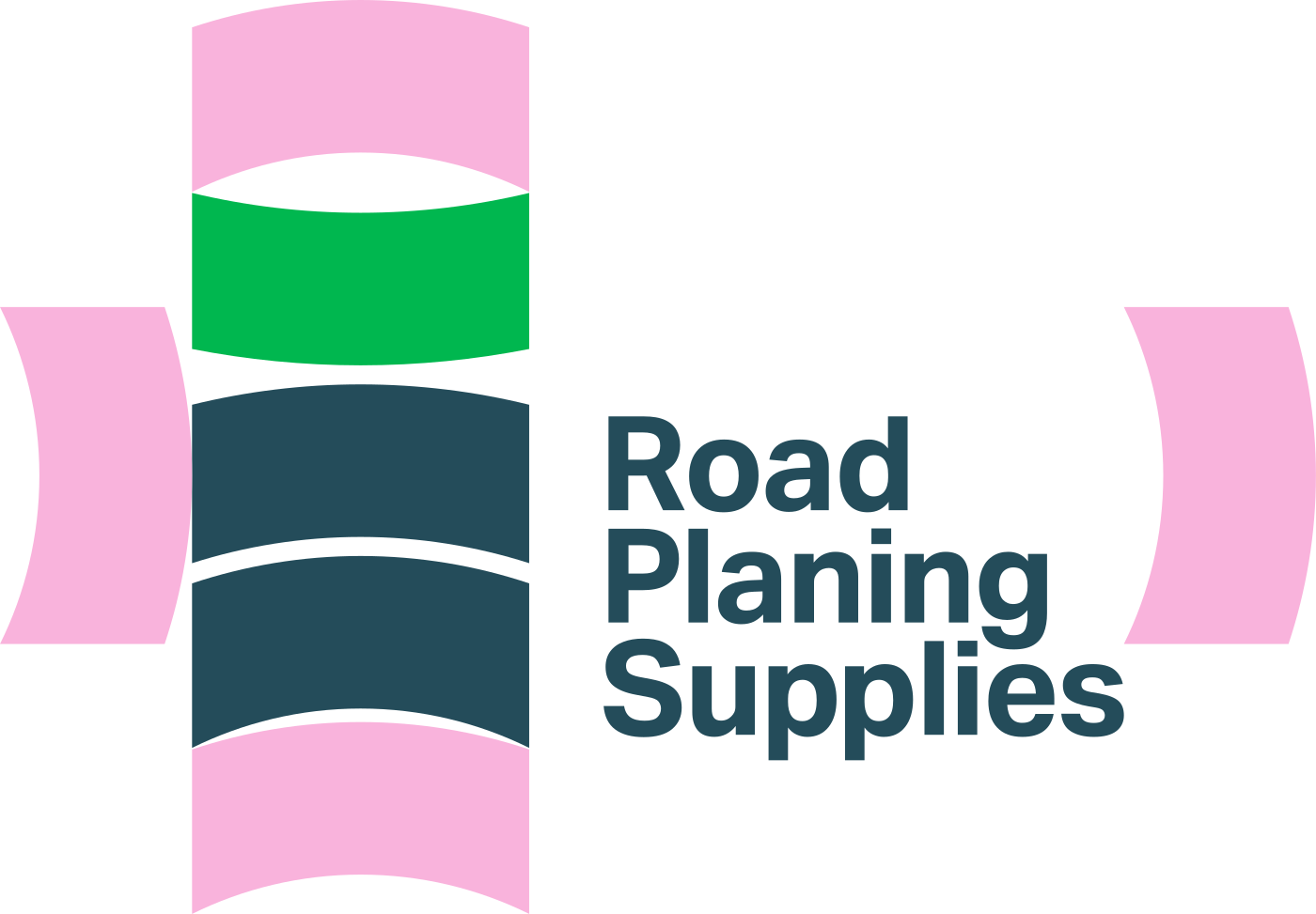
The clear space around it is measured with the mark itself. One bar’s depth above and below, one on its side to the left and right. No rulers, no percentages, nothing to look up.
Foundation and readiness
Two colours do all the work.
Foundation Blue is the base layer: a deep, slightly green blue for the two lower bars, the type and most backgrounds. Readiness Green is the bar on the move, and it’s the only place the eye is asked to go.
- Brand
Foundation Blue
Pantone 7477 C
- CMYK
- 86 29 21 67
- RGB
- 36 76 90
- HEX
- #244C5A
-
Readiness Green
Pantone 7481 C
- CMYK
- 82 0 86 0
- RGB
- 0 183 79
- HEX
- #00B74F
- Sub-brands
ReadyMix Yellow
Pantone 7549 C
- RGB
- 249 194 10
- HEX
- #F9C20A
-
Concrete Teal
Pantone 7466 C
- RGB
- 0 178 186
- HEX
- #00B2BA
Room for more
A mark made of layers is easy to extend. When RPS needed two sub-brands, ReadyMix and Concrete, nothing had to be redrawn.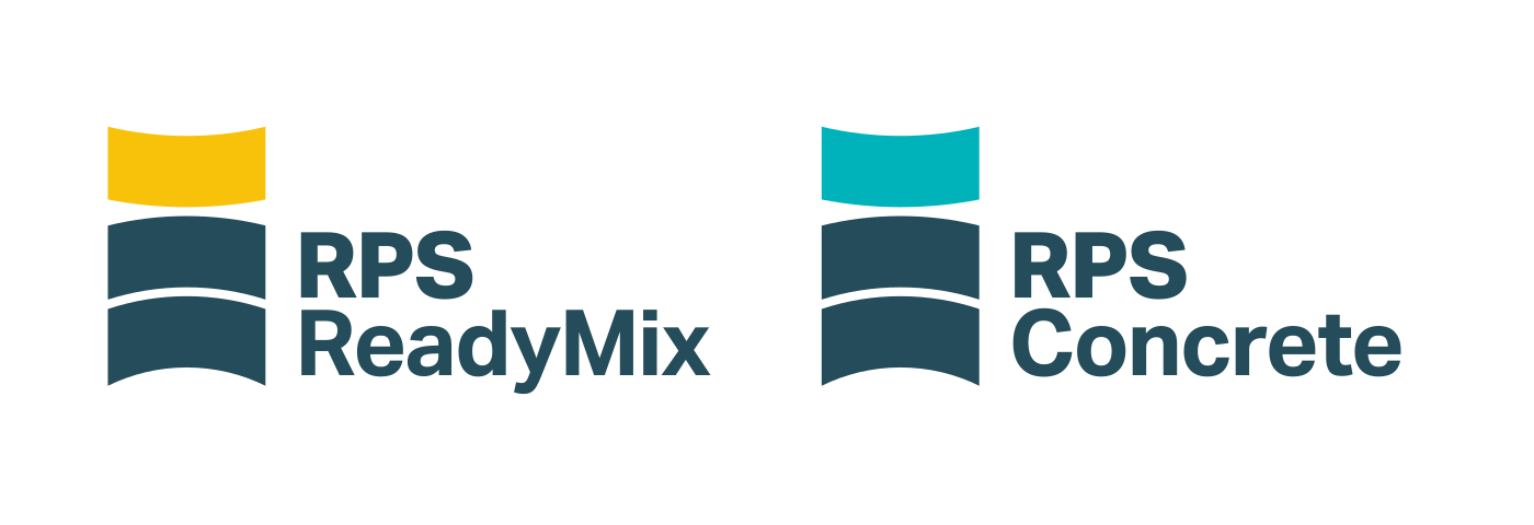
The two blue bars stay exactly where they are. The name goes under RPS, and the top bar changes colour: yellow for ReadyMix, teal for Concrete.
Each one is recognisable on its own (useful when it’s on the side of a mixer). Park them next to each other and they’re obviously one family. And if a fourth name turns up, it needs a colour, not a redesign.
Who’s behind this?







More case studies
- Big Drop Brewing Co.
Big Drop: ten years, and bolder for it
- Deben Carpets & Flooring

Deben: for the flow of home
- BayTree

BayTree: a brand grown from its name
- Cor
Cor: heart, choir and a three-week deadline
- Knowing Works
Knowing Works: insight with people at its heart
- Brandee
Brandee: named for the people behind the bar
- Ipswich.love

Ipswich.love: a heart in the middle of Ipswich