
Case study
Selkie: a seaweed brand with its own tartan
A logotype and a tartan for rope-grown seaweed from the water under Lismore Lighthouse.
- Client
- Selkie Seaweed
- Year
- 2025
- The work
- Brand Identity
- Brand Strategy
About Selkie Seaweed
Selkie Seaweed is the consumer brand of Seaweed Farming Scotland, a family-run business that has grown seaweed on ropes off Scotland’s west coast since 2018. The farm sits in the shadow of Lismore Lighthouse.
A seal in the water
Seaweed Farming Scotland is a family business that grows seaweed on ropes in the shadow of Lismore Lighthouse. It needed a brand people could buy from a shelf: a look, a voice and a reason to pick it up.
The name comes from the neighbours. In Scottish folklore a selkie is a seal in the water and a person on land, slipping between the two by shedding its skin. That felt right for a food that makes the same journey.
From the sea to the kitchen, without losing what it was.
The work covered the strategy, the logotype, a colour scheme and a tartan. Packaging was next, and it never happened.
An S that’s changing

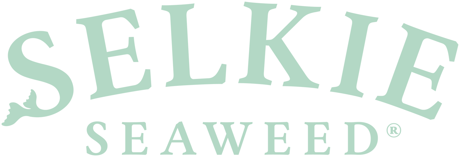
The logotype is an arched serif, the sort of lettering you’d find on a harbour wall or a tin that’s been in the family for years. For a family firm, it had to look like it had always been there.
The typeface is Drummond, and I chose it for its name as much as its letters. Drummond comes from the Scottish Gaelic drumainn, meaning “from the ridge” or “high ground”. A name with the land in it, for a brand that comes from the sea.
It has one trick. The S is changing. Its foot has already become a seal’s tail, and the rest of the letter is on its way: a selkie caught halfway between one thing and the other.
There are three lockups. The first is the name alone. The second adds Rope grown in Scotland on a curve beneath it, and the third adds Est. 2018 between two fronds of seaweed. At small sizes the S goes back to being a letter, because a tail you can’t read is a smudge.
Brand archetypes
Selkie’s personality maps onto four archetypes. The Caregiver, the Sage and the Magician lead; the Explorer adds range, and keeps a traditional brand curious.
- Core archetypes
The Caregiver
A family looking after its water, and what comes out of it.
- Core motivation
- To look after the farm, the sea it sits in and the people who’ll eat what comes off the ropes.
- Tone of voice
- Warm, steady and reassuring. Never preachy.
- In the work
- A family-run farm, with the family’s name behind every pack
- “Rope grown in Scotland” written into the lockup, so the how is never hidden
- A soft, natural palette led by Kelp green and Sea Foam
-
The Sage
Knows its seaweed, and is happy to share.
- Core motivation
- To pass on what the family knows — where seaweed comes from, how it’s grown and what to do with it.
- Tone of voice
- Plain-spoken and honest. No miracle claims.
- In the work
- “Est. 2018” in the fullest lockup, because experience is worth stating
- A classic arched serif that looks like it’s always been there
- A farm you can point to on a map, in the shadow of Lismore Lighthouse
-
The Magician
One thing becoming another.
- Core motivation
- To turn something from the sea into something for the table, and keep a little of the wonder on the way.
- Tone of voice
- Quietly enchanting. A story, not a spell.
- In the work
- The name — a selkie is a seal in the water and a person on land
- An S caught mid-change, its foot already a seal’s tail
- A tartan of its own, woven from the brand’s five colours
- Supporting archetypes
The Explorer
A little way off the map, past the lighthouse.
- Core motivation
- To get people trying something they’ve never cooked with before.
- Role in the brand
- Makes seaweed an invitation, not a health lecture
- Brings the wild west coast into the kitchen — the place is part of the flavour
- Gives the Gorse yellow and Heather pink threads their job, as the spark of something new in a traditional pattern
From the water under the light
Mission statement
From the water under the light.
We’re a family growing seaweed on ropes in the shadow of Lismore Lighthouse, and bringing it to people who care where their food comes from. No mystery and no middle. One family, one farm, one stretch of sea — and something good to cook with.
Reason to believe
We’ve grown seaweed on ropes in the shadow of Lismore Lighthouse since 2018, on a farm you can point to on a map.
We’re a family business, so there’s nobody to hide behind. The people who seed the ropes are the people who bring the harvest in — and the people whose name is on the line if it isn’t good.
Rope grown means nothing is left to chance and nothing is taken from the shore. We put it in the water, we look after it, and we bring it in ourselves.
No miracle claims. No mystery. Seaweed from one stretch of Scottish sea, grown by people who’ll happily tell you all about it.
The Selkie tartan
A Scottish food brand with a tartan is hardly a new idea. Tins and tins of shortbread will back me up on this. A Scottish food brand with its own tartan is a different thing: a pattern nobody else can use, built from the brand’s colours, that can wrap a jar or line a box and say “Selkie” without a word.
I went deep on tartan to get there — deep enough to write a whole post about it. Clans wore their colours to say who they were. Brands do the same thing with a logo and a palette. A tartan does both at once.
Some tartans have travelled a long way from the Highlands. A regiment’s, a clan’s, a fashion house’s, and one registered as recently as 2025. A few of them are on the rail below, keeping Selkie’s company.
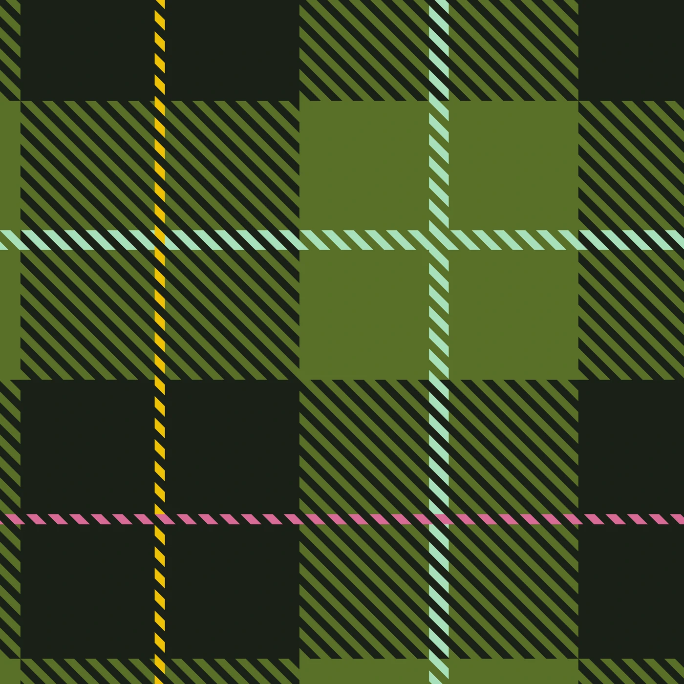
The sett is simple on purpose. Two equal blocks, green and near-black. A stripe of mint through the green. Then one thread of yellow running one way through the black, and one of pink running the other.
One thing I love about digging into new learning is how logical and creative worlds collide. In this case it was how tartan is noted as a threadcount — and how that can be managed in code. Every tartan can be written as a short line of letters and numbers, and I wanted a tool that turned that line into cloth and back again. So I built one. The Tartanator is free, and it exists because of this project.
- The Selkie tartan
Selkie
Kelp and Deep Water in equal blocks, Sea Foam through the green, Gorse one way and Heather the other through the black.
- In good company

Black Watch
The government’s own sett, worn by the regiment since the 1700s.
-

Wallace
Red and black with a single yellow line. The name does most of the talking.
-

MacLeod of Lewis
Yellow and black, and known as the Loud MacLeod for good reason.
-

Burberry
A coat lining from the 1920s that became a trademark, and a corporate tartan in its own right.
-

Witches of Scotland
Registered in 2025, in memory of those persecuted under the Witchcraft Act.
Colour from the boat
The colours come from the view on the way out to the farm. Kelp green and Sea Foam do most of the work: the crop, and the water it grows in.
The two accents are from the cliffs. Heather pink and Gorse yellow, both seen from the boat. In the tartan they’re the two threads you notice last and remember first.
Deep Water, a green so dark it’s nearly black, holds it all together.
- Primary
Kelp
Pantone 574 U
- CMYK
- 47 19 86 41
- RGB
- 99 114 60
- HEX
- #63723C
-
Sea Foam
Pantone 7478 U
- CMYK
- 34 0 28 0
- RGB
- 179 216 197
- HEX
- #B3D8C5
- Secondary
Gorse
Pantone 7405 U
- CMYK
- 0 18 100 6
- RGB
- 234 196 67
- HEX
- #EAC443
-
Heather
Pantone 7634 U
- CMYK
- 13 59 23 0
- RGB
- 204 134 151
- HEX
- #CC8697
-
Deep Water
- CMYK
- 65 57 77 76
- RGB
- 25 35 23
- HEX
- #192317
Sadly, this project was never completed, or paid for by the client. I’m still proud of the work I did, and I reserve all rights and ownership to the work that was created for the client.
Who’s behind this?








More case studies
- Knowing Works

My Health Our Future: a ribbon young people can own
- Big Drop Brewing Co.

Big Drop: ten years, and bolder for it
- Deben Carpets & Flooring

Deben: for the flow of home
- BayTree

BayTree: a brand grown from its name
- Road Planing Supplies

RPS: three bars and a road surface
- Cor

Cor: heart, choir and a three-week deadline
- Knowing Works
Knowing Works: insight with people at its heart
- Brandee

Brandee: named for the people behind the bar
- Ipswich.love

Ipswich.love: a heart in the middle of Ipswich